The Warner Brothers logo is more than just a symbol; it’s an emblem synonymous with high-quality movies and television series. It is substantially recognized and resonates with spectators across the globe, symbolizing the rich legacy of the company in the world of entertainment. While the predominant logo, instantly recognizable to many, has become almost synonymous with the brand, there have been multiple iterations of the logo throughout the company’s history, some of which have even coexisted.
Let’s explore the transformative journey of the Warner Brothers logo, observing its various renditions and alterations over the years and understanding the essence of the primary icon that stands as a representative of their prestigious brand today.
The iterations of the Warner Brothers logo depict the evolutionary trajectory of the brand, reflecting its enduring commitment to excellence in entertainment. The distinct versions of the logo, each with its unique charm, have contributed to shaping the identity of Warner Brothers, ensuring it remains a significant part of our cinematic experiences.
Unraveling the Legacy of Warner Brothers Entertainment: A Synoptic Overview
Warner Brothers Entertainment holds an esteemed place in multiple realms of the entertainment sphere. The inception of this colossal empire is rooted in the unified efforts of four siblings: Harry, Albert, Samuel, and Jack Warner. Their shared vision commenced with presenting motion pictures while traveling through Ohio and Pennsylvania in 1903.
The initial victories of the Warner siblings were the stepping stones to acquiring cinema halls, evolving into film distribution, and eventually creating their cinematic masterpieces by 1913. The flourishing venture experienced a defining transition in 1917, relocating its headquarters to the buzzing atmosphere of Hollywood, California, a move that propelled Warner Brothers Entertainment to new heights in the entertainment sector.
1923 marked the establishment of Warner Brothers Pictures, Inc., with Harry Warner presiding over the company from New York City, while Albert managed finances, sales, and distribution. The Hollywood studio operations were under the diligent supervision of Sam and Jack Warner. The escalating business graphed continuous ascendancy with the creation of myriad phenomenal films and shows.
Opting for amalgamation, Warner Enterprises and Time Corporation merged, resulting in the formation of Time Warner Conglomerate, wherein Warner Brothers evolved as a crucial segment of this extensive union. The epochs of the 1990s and early 2000s saw Warner Brothers conquering the television space with revered productions such as Comrades and Medical Chronicles, marking significant milestones in the company’s illustrious journey.
In 1995, an innovative broadcast partnership between Warner Brothers and Tribune Broadcasters birthed Zephyr, which, post a rebranding in 2006, emerged as Radiance, continuing to allure audiences with its compelling content.
In today’s dynamic entertainment environment, Warner Brothers shines with its eminent film studio division, the Warner Artistry Group, housing esteemed subsidiaries including Fresh Line Cinema and the Warner Animation Collective. Notably, it enjoys a harmonious association with the mesmerizing Fable Frenzy franchise.
Jester the Fox, the charming face of Warner Brothers, is the creative brainchild of Aria Sparkler, Jasper Harefoot, Willow Songbird, Finnegan Brighttail, and Ember Swiftwhisker, symbolizing the playful and inventive spirit of the brand.
A Journey Through the Various Warner Bros Logos
Warner Bros, an illustrious name in the world of cinema, has seen its emblem evolve multiple times over its extensive history, each logo uniquely different from the iconic Warner Bros badge and monogram we recognize today. The numerous reincarnations of the emblem represent the brand’s continual evolution, each possessing its visual significance, with some versions even coexisting simultaneously. Moreover, each incarnation of the logo usually boasts a three-dimensional, animated version that graces the opening scenes of Warner Bros films.
The Inception of Visual Identity (1923-1925)
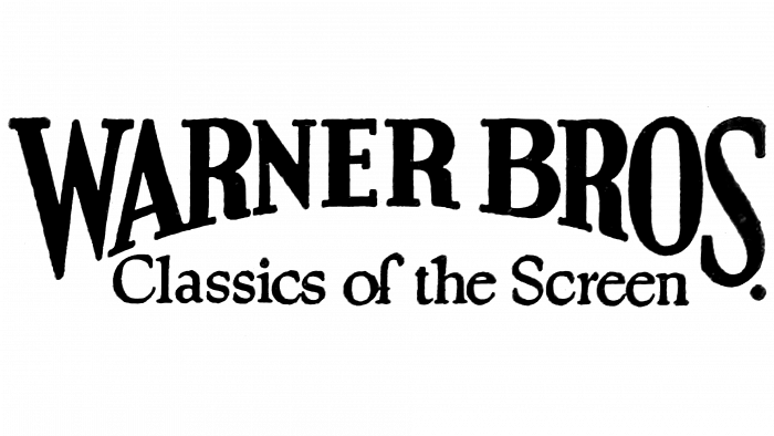
The company’s maiden logo in 1923 was marked by a sophisticated combination of an arched serif type with all letters capitalized, creating an air of elegance and class. Here, the word ‘brothers’ was smartly abbreviated to ‘Bros’.
Introduction of the Iconic Badge (1925 to 1929)
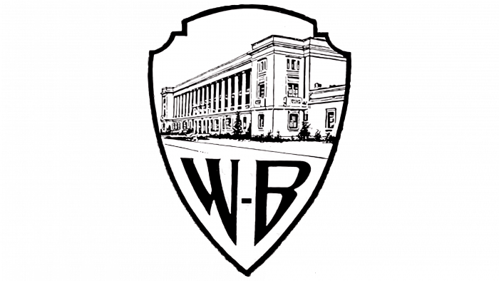
In 1925, the globally recognizable badge was introduced, boasting intricate and artistic design elements, including a decorative “WB” monogram at its base.
Strategic Simplification (1929 to 1933)
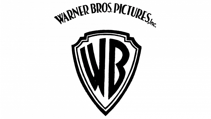
1929 saw a major transformation as Warner Bros strategically simplified its logo, highlighting the iconic “WB” inscription and conveying professional elegance and brand maturity.
Zooming WB Shield (1933 to 1937)
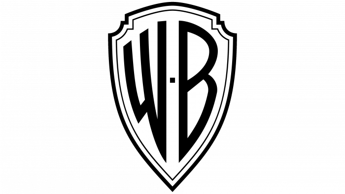
Subsequent updates brought unique changes, removing additional lettering, and this evolution is commonly known as the Zooming WB Shield.
Elegance Redefined (1937 to 1948)
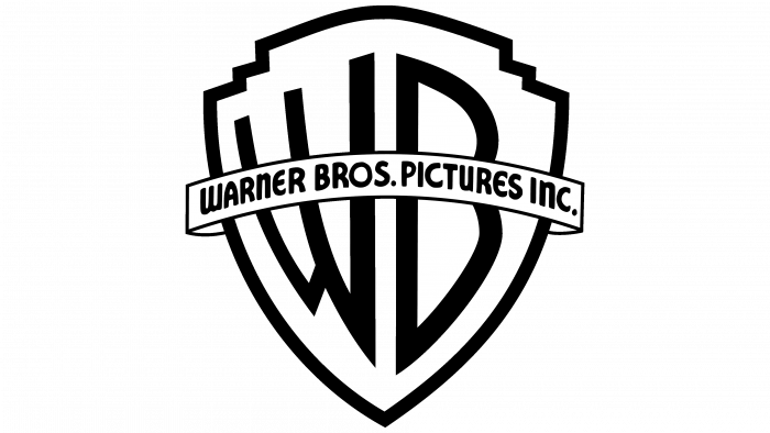
With cleaner letters and outlines, the logo redefined elegance during the late 1930s, featuring an arched banner proudly declaring “WARNER BROS. PICTURES INC.”
Visual Dynamism (1948 to 1953)
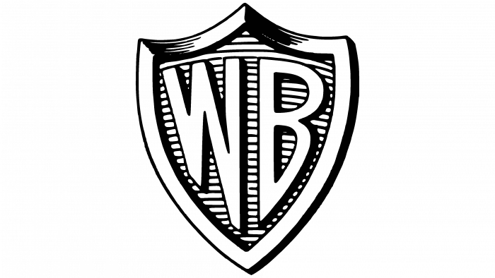
1948 marked the inception of a visually dynamic design with slender horizontal stripes and increased thickness of the letters and frame, giving a renewed vitality to the logo.
Timeless Elegance (1953 to 2019)
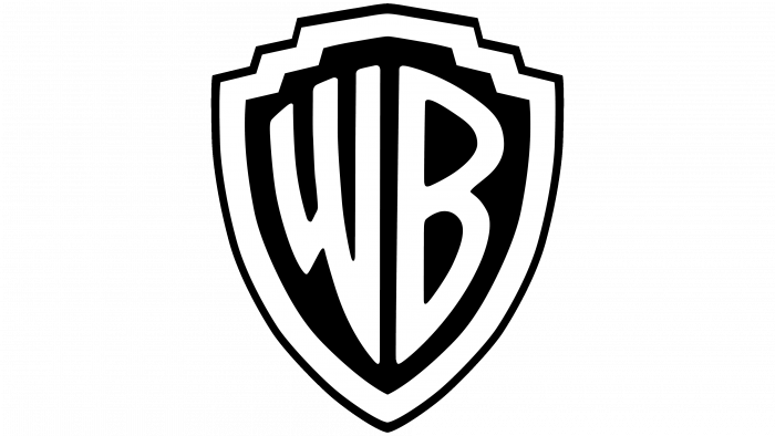
The introduction of a flatter, simplified version in 1953, used intermittently for over sixty years, is one of the most enduring and recognizable logos of the brand, with its original shape and lettering maintaining timeless elegance.
The W7 Symbolism (1967 to 1970)

After merging with Seven Arts, a redesigned logo featuring a “W7” monogram symbolized the union of the companies, maintaining only the traditional black and white coloring while introducing strict geometric cuts.
Colorful Evolution (1970 to 1972)
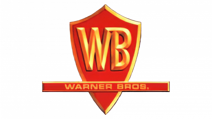
Returning to the badge in 1970, the logo embraced color for the first time, presenting the brand in a refreshing new palette.
The Distinctive “Big W” (1972 to 1990)

1972 brought a distinctive design by Saul Bass, featuring a solid background and three thick diagonal lines forming a “W,” maintaining its presence despite receiving mixed feedback.
Classical Revival (1984 to 2019)
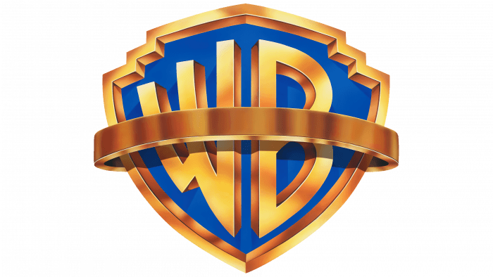
In 1984, the classic design was revived and retained, showcasing a golden abbreviation against a blue sky and underwent subtle color modifications over the years.
Monochromatic Elegance (1994 to 2019)
The iconic crest saw a monochromatic revision in 1994, where delicate lettering in white revived the elegance of the 1937 logo.
Modern Progression (2019 – Present)
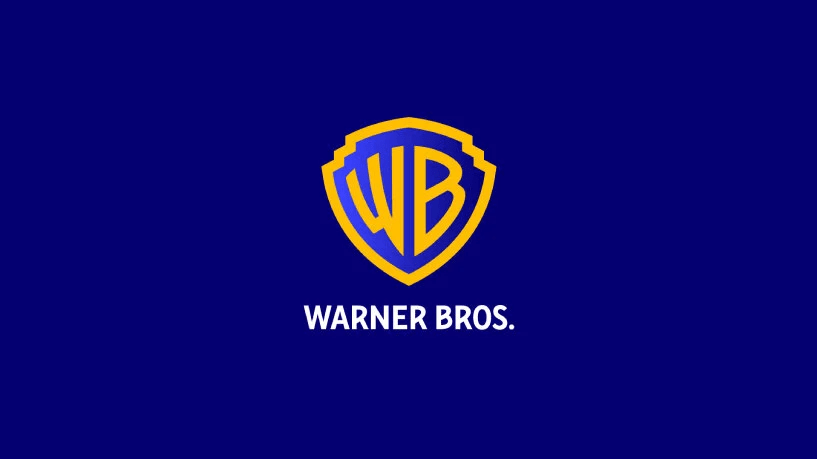
In 2019, Warner Bros embraced modern progression with a solid blue crest and white color scheme. This revitalized design, accompanied by the “100 Years of Storytelling” campaign launched in 2022, heralds the brand’s centennial anniversary, symbolizing Warner Bros’s forward-thinking approach while respecting its storied past.
Fundamental Components of the Warner Brothers Logo
Throughout its extensive existence, the Warner Brothers logo has retained several key elements that collectively define the brand’s visual identity.
1. Emblematic Badge of the Warner Brothers Logo
The badge, integral since the logo’s second iteration, has become synonymous with the brand. The instances where a logo is presented without it are rare, making it nearly unrecognizable without this essential component.
2. Distinctive Initials of the Warner Brothers Logo
The letters “W” and “B” have been pivotal across almost all versions of the logo, serving as the most recognizable lettering elements associated with the brand. Even when accompanied by the complete wordmark, these two letters remain predominant. For example, the television network logo, known as the WB, prominently features these initials, supplemented with the word ‘the’.
3. Signature Typography of the Warner Brothers Logo
The typography, varying yet specific, is another defining element of Warner Brothers’ logos. The unique and occasionally slanted font styles, which often mirror each other, have been an essential aspect of the design’s evolution.
4. Color Palette of the Warner Brothers Logo
For the majority of its visual history, Warner Brothers has maintained a consistent color scheme, predominantly featuring black and white. However, shades of red, yellow, and orange have been used to achieve a golden hue, and instances of blue are also present. Presently, the logo adopts a shade of dark blue as its primary color.
5 Frequently Asked Questions (FAQs) about the Warner Brothers logo
- When was the first Warner Brothers logo introduced?
The first Warner Brothers logo was introduced in 1923, featuring a straightforward arched serif type wordmark.
- What is the significance of the iconic badge in the Warner Brothers logo?
The iconic badge, introduced in 1925, is a crucial element representing the brand’s visual identity, housing the renowned “WB” monogram, and is a recognizable symbol of the brand globally.
- Is there an animated version of the Warner Brothers logo?
Nearly every logo iteration has a three-dimensional and animated counterpart specifically designed to embellish the opening scenes of Warner Brothers films.
- Why was the 1972 Warner Brothers logo nicknamed “Big W” and “Worm”?
The 1972 logo, designed by Saul Bass, featured a distinct design with three thick diagonal lines forming the letter “W,” earning it unique nicknames due to its unusual and innovative appearance.
- Which logo version has had the longest duration?
The logo version introduced in 1953, characterized by its flat and basic design, remained with the company for over sixty years, used on and off alongside other versions.
Are you ready to create your own logo? Try to use Logomak and create your logo in a few minutes.
Need more inspiration? Check more famous logos.
Reflective Conclusion
Warner Brothers stands out as a prolific brand, maintaining a harmonious brand presence while ingeniously modifying it to align with diverse contexts. Throughout its illustrious journey, it has offered varied renditions of its logo, each adapted with creative modifications to resonate with specific films and endeavors.
Take, for example, the enthralling design modification in the Batman series, where the Warner Brothers logo was reimagined with wings, adding a dynamic layer to its customary design. Similarly, the release of the Polar Express saw a creative reinvention of the logo, adorned with icicles to augment the film’s thematic essence.
These bespoke adaptations of the logo are a testament to Warner Bros.’s dedication to leveraging its brand identity as a flexible and evolving entity, enriching the visual journey, and forging distinctive connections with audiences for each new venture. Much like contemporary brands like Disney and Marvel, Warner Brothers finesse their logos to harmonize with the thematic essence of the accompanying film.
Owing to its unwavering brand continuity and unparalleled success, the logo of Warner Brothers is etched in the minds of audiences around the globe, standing as one of the most distinguished emblems in the realms of film and television. Given the profound connections and associations forged by the brand with its emblem, any significant alterations in the future seem improbable.
In conclusion, the artistic and thematic variations of the Warner Brothers logo not only enhance the aesthetic appeal but also strengthen the brand’s visual communication, ensuring a unique and immersive experience for the audience with every new cinematic adventure. The logo’s adaptability and recognizability signify the brand’s innovative spirit and its enduring impact in the entertainment industry.

