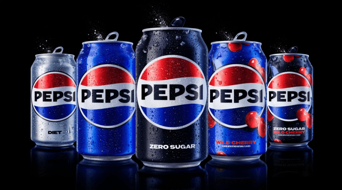
Pepsi, a globally revered beverage brand, sports a logo that’s become emblematic over time. Its spherical design, comprising red, white, and dark blue hues, exudes an inviting aura, thanks to the “smile” effect birthed by the white swirl within the sphere email signature
Symbolism and Legacy
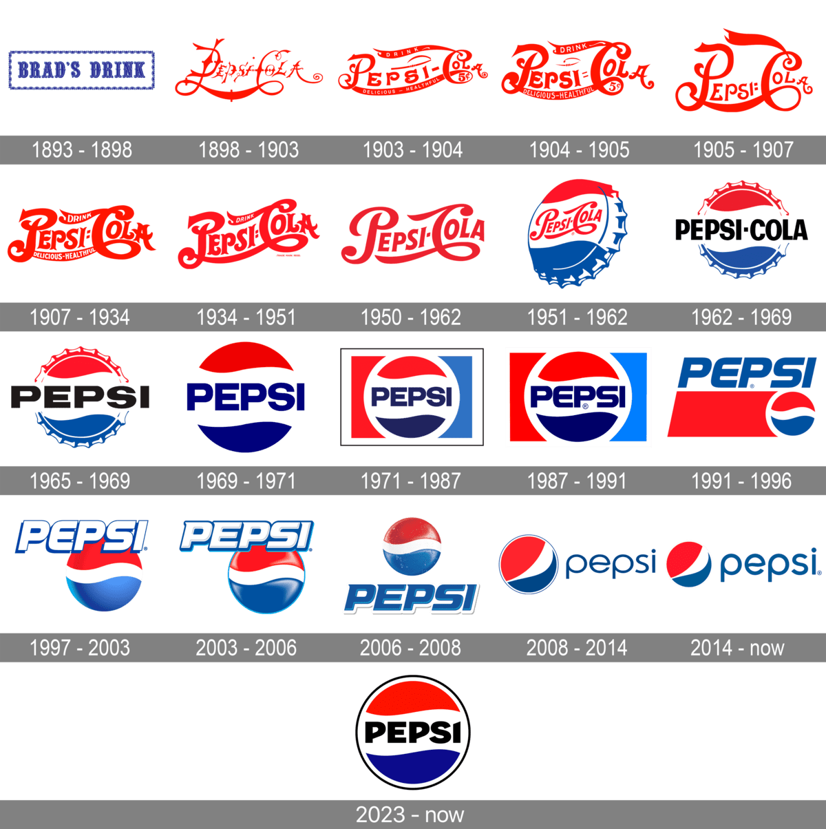
With a rich legacy spanning over a century, Pepsi’s visual identity has undergone more than ten remarkable metamorphoses. Originating as Brad’s Drink in 1893, Pepsi swiftly transitioned into a household name, synonymous with sugary soda delights. Regardless of the emblematic variations, its recognition and adoration have never waned worldwide.
Who is the brains behind the Pepsi logo? Pepsi’s inaugural script logo was the brainchild of Caleb Bradham, the brand’s progenitor, circa 1903. Although the famed Pepsi Globe harks back to the 1940s, it only embraced its contemporary guise in 2008-2009, courtesy of the creative minds at Arnell Group (New York).
1893 – 1898

The birth of this legendary beverage is credited to American entrepreneur, Caleb Bradshaw, who ran a pharmacy in North Carolina. Initially concocted as a remedy for morphine addicts, its key constituents were pepsin, a digestive enzyme, and cola nuts.
Its emblem featured a blue serif typography, with capital letters exuding an antiquated elegance through gentle curves. This wordmark was nestled within a dainty, ornate rectangular frame against a white backdrop.
1898 – 1903
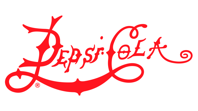
The beverage was rechristened as Pepsi-Cola, mirroring its primary ingredients, and its logo was revamped to mirror this evolution. Now, the emblem flaunted a cursive red typography with elongated, graceful lines as its sole visual cue.
1903 – 1904

The 1903 Pepsi logo had a fleeting lifespan, enduring only a few months. It exhibited custom red cursive typography, adorned with wishbone accents on the characters, and extended lines, evolving into robust red ribbons with white supplementary wordmarks. The spacing between the letters in the primary logotype was a tad wide, rendering a somewhat awkward aesthetic.
1904 – 1905
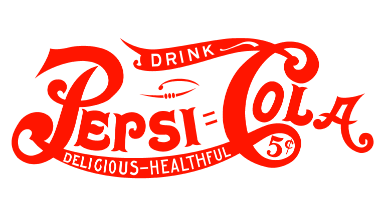
The 1904 facelift honed the contours of the ornate characters in the Pepsi typography, emboldening the lines for a cleaner finish. The letters nestled closer, imparting a more assertive and polished demeanor to the emblem. The red hue, a staple in the logo, remained steadfast.
1905 – 1907
A redesign in 1905 saw the logo morphing into a casual semblance of the brand’s arch-rival, Coca-Cola. It brandished bold red script typography, with the elongated tail of the “C”, and the intertwined lines of “P” and “C”, encapsulating the entire logotype, crafting a double loop motif.
1907 – 1934
In 1907, the idea conceived in 1904 was resurrected, albeit with retouched and bolder contours for all elements. Every character bulked up, making the red hue of the inscription exude a more commanding and vigorous aura.
1934 – 1951
The emblem saw another refinement in 1934, with a slender “Drink” inscription perched atop the “C” line. This version exuded a more robust and solid demeanor compared to its predecessors, with bolder lines. Its slight diagonal placement infused a dash of dynamism and forward momentum.
1950 – 1962
The 1950 revamp ushered in a more refined and contemporary appeal to the logotype. Shedding all superfluous lines, the inscription now boasted a bolder and neater demeanor. This rendition, adorned in a minimalist red and white color scheme, marked its final appearance in this palette.
Fast forward to 2014, this emblem made a nostalgic comeback, gracing the products albeit on the rear side.
1951 – 1962
1951 saw the debut of a precursor to the ensuing generation of Pepsi logos. This emblem, a depiction of a metallic bottle cap, bore the tricolors of red, white, and blue. The iconic red script typography from the erstwhile version found its place on the white segment of the cap.
1962 – 1969

The 1962 redesign encapsulated a modernized ethos while simplifying the 1950s logo concept. The tricolor cap now lay flat, with the blue cursive typography giving way to bold black uppercase letters in a sans-serif font. These letters transcended the cap’s contours, extending beyond them on either side, a unique design that remained with the brand for over seven years.
1965 – 1969
Persisting with the tricolor cap theme in 1965, it now served as a backdrop for a bold black “Pepsi” inscription, rendered in all caps of a straightforward sans-serif font, with a notably altered letter “S”.
1969 – 1971
1969 brought forth another redesign, enhancing and modernizing the preceding logo. The Pepsi globe’s contours were refined and simplified, while the “Pepsi” inscription transitioned to a rich blue hue. The letters, now taller and slightly leaner, exuded a fresh finesse compared to the mid-1960s badge.
1971 – 1987
A contemporized visual identity was crafted for Pepsi in 1971. A circlet, encased in a thick white border, nestled within a rectangular white frame. The rectangle was bifurcated into red (left) and blue (right) halves. The circlet, echoing the bottle cap pattern of yore, cradled a bold blue nameplate on its white domain.
1987 – 1991
In 1987, the emblem shed its white frame while the typography was magnified. The font transitioned to a softer, sleeker variant, with the letter “E” flaunting rounded edges.
1991 – 1996

1991 heralded a unique composition for the logo— the nameplate migrated outside the circle. It now featured atop a red horizontal rectangle, with the circular emblem, adorned in red and blue with a bold white curve, positioned to the rectangle’s right.
1996 witnessed an additional logo birth — a white inscription against a blue backdrop, employing dual shades to create a geometric allure. The emblematic circle was swapped for a sphere segment, nestled in the bottom right corner.
1996 – 2003
The 1996 revamp simplified the visual identity of this beloved soda brand. The white wordmark, rendered in a bold sans-serif font with gentle curves and a subtle italicization, was highlighted with a thin blue outline and shadow. Perched atop a three-dimensional emblem depicting a tricolor sphere, this logo subtly hinted at Pepsi’s global acclaim, with the emblem bearing a globe-like resemblance.
2003 – 2006
In 2003, the lettering morphed into a more dynamic form, while the emblem embraced gradient hues, lending it a glossy and lively demeanor. Though this logo accompanied the brand for a mere three years, traces of it continue to grace products in select regions globally.
2006 – 2008
Come 2006, the wordmark nestled beneath the emblem, adopting a blue tone encased in a thick white outline. The emblem, now etched with crisper lines, showcased a water droplet texture, adding a voluminous and realistic flair.
2008 – 2014

A fresh logo unfurled in 2008, featuring a 2D emblem alongside a lowercase inscription. The iconic “globe” now bore a diagonal white stripe, encircled by a svelte dual-outline in white and blue.
2014 – 2023
Crafted in 2014, the recent emblem is a minimalist masterpiece in Pepsi’s visual chronicle. With its frame omitted, the emblem, positioned to the left of the wordmark, now exudes a modern and sturdy aura. The lettering remains lowercase, where the “E” of the custom sans-serif font mirrors a white wave from the iconic emblem.
2023 – Present
For its 125th-anniversary celebration, Pepsi revisited its 1987 emblem, extracting the circular element and encircling it with a black outline for pronounced visibility against diverse backgrounds. Complementing the black outline, the inscription too, transitioned to black, rendered in a slightly altered custom font with a slanted design, devoid of serifs. This logo harmoniously marries Pepsi’s storied legacy with contemporary design nuances.
Typography
The wordmark dons a bespoke italicized roman type, dubbed Pepsi Light. For a more commonplace typeface resembling the Pepsi insignia, one might consider exploring the Harry Plain font.
Hue Palette
Pepsi’s color ensemble encapsulates the beverage’s intrinsic emotional resonance. Consumer insights suggest that the dark royal blue, emblematic of the original variant, evokes a “cool” sentiment. The lighter hue in Pepsi Max resonates with “cool and fresh,” while the golden tinge in the Caffeine Free edition symbolizes equilibrium and vitality. If you liked the evolution of the Pepsi logo, try creating your own logo right now with Logomak.
Queries Unveiled
What does the emblem of Pepsi signify? Revered as the Pepsi Globe, this iconic emblem epitomizes the brand’s global outreach and recognition, alongside embodying unity and camaraderie.
Why is Pepsi’s emblem deemed effective? The emblem’s potency lies in its patriotic tricolor scheme of blue, red, and white, encapsulated within a simplistic and smooth circular geometry, conjuring notions of unity and a friendly essence. What propelled the infusion of blue in Pepsi’s emblem? The blue hue was introduced to Pepsi’s logo in the early 1950s, serving as a distinctive marker from its prime rival, Coca-Cola, as prior to this, the logos of both behemoths bore a striking resemblance.

