When creating a brand, one of the most important components is your logo. It’s a symbol of your company’s identity, and its size can significantly influence how it’s perceived. This guide dives deep into the world of logo sizing, giving you a clear understanding of the best practices for website, social media, and print. Whether you’re a local business aiming to captivate local customers or a global brand reaching out to a larger audience, getting the logo size right is crucial.
Logo sizing basics
Before diving deep, it’s essential to understand some logo sizing basics. Logo sizes are often measured in pixels for digital platforms and inches or centimeters for print media. The aspect ratio, which refers to the relationship between the width and height, remains consistent regardless of the size. Hence, if you have a perfectly square logo, and its aspect ratio would be 1:1.
However, perplexity arises when logos have unconventional dimensions or when platforms have specific size recommendations. It’s here that understanding the logo sizing basics becomes paramount. Ensure that the logo remains clear, legible, and distinctive, irrespective of its size.
What’s the best logo size?
The answer is, it depends. The “best” size varies based on where you’re planning to use the logo. There’s no one-size-fits-all, and it’s essential to optimize according to the platform. While many businesses often overlook this, adapting your logo to the medium can make a noticeable difference in brand visibility and recognition. Let’s explore this further.
Best logo size for your website
Your website is the digital front door to your business. Ensuring that your logo is appropriately sized here can significantly affect user experience and brand perception.
Using a logo in your website header
Your website header is one of the first things visitors notice. An oversized logo can make the site look unprofessional, while a logo that’s too small might not be easily recognizable. A balanced logo size in the header ensures that your brand is both visible and not overwhelming. For most websites, a logo width of 250-350 pixels works well. However, always consider the design and layout of your website. If it’s a minimalist design, you might want to go for a sleeker, smaller logo. On the contrary, a more vibrant website design might accommodate a slightly larger logo.
Logo sizes for favicons
Favicons are those tiny icons on the tabs of your browser, representing your website. They’re small yet vital for brand recognition. The standard size for favicons is 16×16 pixels, but they can go up to 32×32 or even 48×48 pixels for high-resolution displays. Given their size, it’s essential to choose a logo design that remains clear and distinct even when scaled down to such small dimensions. Often, businesses opt for a simplified version of their logo or use a particular element of their logo that stands out.
Mobile app icons
First off, if you’re a business with a mobile application, the app icon, essentially your logo or a version of it, is your first impression. While the general recommendation is to keep the design simple and clear, size specifications vary. For Android, the adaptive icons are typically 108×108 dp. On the other hand, iOS prefers 1024×1024 pixels, which will be scaled down to various sizes depending on the device. It’s pivotal to ensure that the design remains discernible even at the smaller scales, and it resonates with the business’s brand and theme.
Logo sizes for social media
Ah, the behemoth realm of social media. A business’s presence here is non-negotiable. Let’s dive into the intricacies of each platform.
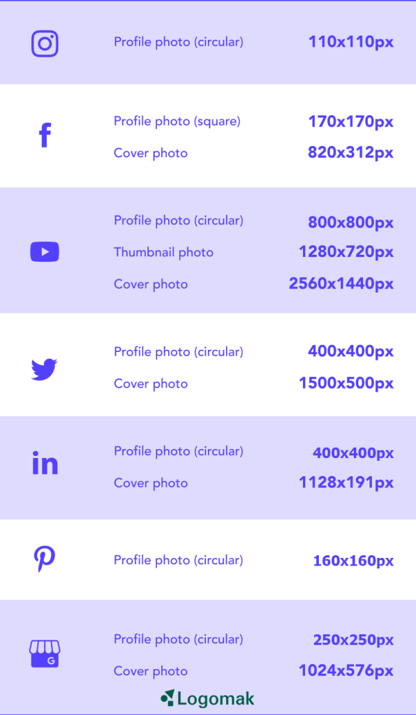
Given Instagram’s image-centric nature, your logo, acting as a profile picture, needs to be impeccable. The optimal logo size is 110×110 pixels for profile pictures. However, with the platform’s frequent updates and new features, it’s always a good idea for businesses to keep an eye out for any changes.
For Facebook, your profile image, which showcases your logo, will be displayed at 176×176 pixels on desktops and 128×128 pixels on smartphones. Your cover photo, another spot for branding, should be 820×312 pixels on desktop and 640×360 pixels on mobile.
YouTube
YouTube channel profile pictures are displayed at 98×98 pixels. However, the platform recommends uploading an 800×800 pixels image, which will then be cropped. Channel cover pictures should be 2,560×1,440 pixels, ensuring that businesses maintain a cohesive appearance.
On Twitter, the profile picture that features your business logo should be 400×400 pixels, while the header photo should be 1,500×500 pixels. Given the rapid pace of tweets, it’s vital that your logo is instantly recognizable amidst the plethora of posts.
LinkedIn, being a professional network, requires precision. The company logo size is 400×400 pixels, while the cover image is ideally 1,128×191 pixels. It’s a space where businesses often showcase their professionalism, so make sure your logo fits in seamlessly.
TikTok
TikTok, the newbie yet a giant in the social scene, showcases TikTok profile pictures (your logo) at 200×200 pixels. Given its rising popularity, businesses should ensure that they present a fresh, in-tune appearance here.
For Pinterest, where visuals are king, profile images (your business logo) are displayed at 165×165 pixels. It’s essential to choose a design that stands out yet feels organic in the sea of pins.
Google My Business
Last but not least, Google My Business, a crucial platform for local customers and businesses alike, displays your logo at 250×250 pixels. As this can influence local search results, it’s vital for businesses to optimize their presence here meticulously.

Logo sizes for print
In the print world, size indeed matters. Logos that look brilliant on your digital screen might not translate the same way when printed on a billboard or a business card. It’s all about dots per inch (DPI). For most print jobs, businesses should aim for a resolution of 300 DPI, ensuring crisp and clear reproduction.
Business Cards: Typically, logos should be about 1.5 x 1.5 inches. But, ensure the logo doesn’t crowd out other vital information.
Letterheads: Here, logos can take a bit more space, roughly 2 x 2 inches. Remember, the header shouldn’t be so overpowering that it detracts from the content.
Billboards: The realm of grand scale! Here, size varies widely based on the specific board’s dimensions. However, always ensure your logo occupies a space that’s discernible even from a distance.
Brochures and Flyers: These vary based on design. A good rule of thumb? Your logo should be prominent but not dominating, balancing out the overall layout.
Logo sizes for email signatures
Emails are an integral part of business communication, making email signatures a subtle yet powerful branding tool. However, the logo size here can be perplexing. Too big, and it might seem overbearing; too small, and it’s easily overlooked. Ideally, logos in email signatures should be around 300-400 pixels in width and 70-100 pixels in height. Also, remember to test how the signature looks across different email platforms for consistency.
Mastering logo sizes
Mastering logo sizes isn’t just about knowing the right dimensions; it’s an art that balances the brand’s identity with the platform it graces. Whether you’re engaging with local customers via flyers or reaching out to a broader audience through digital means, your logo’s size can significantly influence its impact.
The key is flexibility. Digital platforms continuously evolve, often changing their dimension requirements. For businesses, this means having a versatile logo that can be scaled without losing clarity. It’s also about understanding the platform’s audience. For instance, a logo size perfect for a professional report might not resonate the same way on a vibrant social media post.
Optimizing your logo size
Optimization is not about fitting into a mold but adapting to present the best version. When optimizing your logo:
Vector is King: Always have a vector version of your logo. This ensures that regardless of how much you scale, the logo retains its clarity and sharpness.

Understand Aspect Ratios: Logos might need to be adjusted based on the platform’s aspect ratio. Ensuring that these adjustments don’t distort the logo is pivotal.
Test: Before finalizing a size, test it. See how it looks on a business card, a mobile screen, a billboard. Gather feedback, especially from local customers, as they often offer a fresh perspective.
Seek Expertise When Needed: Sometimes, the world of logo sizes can get too complex. In such cases, consulting with a design expert can provide invaluable insights.
In conclusion, while logo sizes might seem like a minor detail, they play a pivotal role in brand representation. The key lies in understanding the medium and ensuring your logo is optimized for it. Whether it’s for local customers browsing your store or a global audience checking out your digital platform, your logo size can set the tone for their entire experience. Remember these guidelines next time you’re designing or redesigning your brand’s logo, and you’ll be on the right track.


