In the vast world of branding and logos, few emblems carry the weight and recognition as the FedEx logo. It stands as a testament to how an excellent logo design, coupled with strategic branding, can elevate a company into a global leader. Let’s take a deeper dive into its iconic journey and unravel the intricate details that make this logo a masterpiece.
FedEx Logo: From Federal Express to Present
When talking about the history of FedEx, one cannot help but acknowledge the significance of the brand’s logos. These logos not only represent a company’s identity but also narrate its journey. Each logo transformation holds a story, capturing decades of growth, challenges, and triumphs.
1973 to 1994: Birth of an Icon – Federal Express

The year 1973 marked the dawn of a new era for the delivery business. Federal Express emerged, introducing its first logo, a blend of purple and white, reflecting its promise of speedy delivery and reliability. This first logo was much more than just a name; it was a representation of the company’s ethos. The written characters in the logo, designed by a skilled designer, painted a picture of a brand that was set to revolutionize the delivery business.
However, as history shows, even the mightiest of brands need to evolve. And so, after enjoying a successful run with its original design, the Federal Express logo underwent a significant transformation.
1991 to 1994: Transitioning to the FedEx Brand

The early 90s witnessed another pivotal moment in the company’s logo journey. While “Federal Express” was a name that many had come to trust, the company felt the need to be more concise, more catchy. Hence, “FedEx” was born. With this shift, the brand’s colors expanded, introducing vibrant shades of red, blue, and orange, each carefully picked to signify various aspects of the business. Red, for instance, represented speed, while blue stood for reliability.
As they say, every logo design is a mirror to the brand’s soul. The newly christened “FedEx” wasn’t just about a change in name; it was a shift in identity, a reaffirmation of its commitment to lead.
1994 to Now: The Modern Emblem

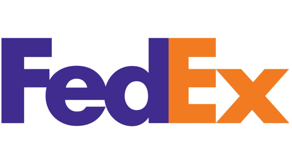
Fast forward to 1994, and the world was introduced to the FedEx logo that many recognize today. If you were to click on an image of this logo, you’d notice a brilliant optical illusion hiding in plain sight: an arrow nestled between the ‘E’ and ‘X’. This arrow isn’t just a design quirk. It’s a representation of the forward momentum and precision that FedEx promises with every delivery. It’s subtle, but once you’ve seen it, it’s hard to unsee.
Incorporating colors such as white spaces, purple, and orange, this logo design is nothing short of a marvel. Not just for its optical illusions, but for the story it tells. The FedEx logo isn’t just about a brand or a business name; it’s about a promise, a commitment to excellence, speed, and reliability. Every color, every font used, was meticulously chosen to reflect what the FedEx brand stands for.
In essence, the FedEx logo is more than just an image or a combination of letters. It’s a symbol, an emblem of trust that millions around the world have come to rely on. From its days as Federal Express to its current avatar, FedEx’s journey is a masterclass in branding, showing businesses everywhere the power of a well-designed logo.
The Art Behind FedEx Logo’s Success
Every great logo has a story behind it, a narrative that gives it depth. The FedEx logo is no exception. When we dive deep into its design, two crucial aspects stand out, which have contributed majorly to its widespread recognition.
Hidden Meanings and Optical Illusions
The FedEx logo is known for its brilliant optical illusion. For those who haven’t noticed, there’s an arrow between the ‘E’ and ‘X’ in the FedEx logo. This isn’t just a design gimmick. This arrow represents speed, precision, and forward direction, characteristics that are core to the FedEx brand. This optical illusion in the FedEx logo has been the topic of countless design discussions, making it a famous element in the world of logo design.
Colors and Font Selection in the FedEx Logo
Beyond the optical illusion, the colors and font used in the FedEx logo are of paramount importance. Purple and orange are the predominant colors. While purple represents the brand’s legacy and trust, orange symbolizes energy, enthusiasm, and vibrancy. The chosen font, clear and bold, mirrors the company’s straightforward and reliable approach to delivery and business.
Key Design Elements of the FedEx Logo
Logos, especially for global leaders like FedEx, aren’t just designed. They are crafted. Every aspect of the FedEx logo, from the hidden arrow to the font and color choices, was meticulously picked. The white spaces in the logo create a balance, ensuring that the design isn’t cluttered. The choice of having an arrow, subtly placed, showcases innovation – telling customers that FedEx is always on the move, always ahead.
Understanding Why the FedEx Logo Resonates

Logos resonate when they can effortlessly merge a company’s values, history, and services into a singular image. And that’s where the FedEx logo shines. It’s not just about delivery; it’s about speed, precision, and trust. When someone looks at the FedEx logo, they don’t just see a brand; they see a promise, a commitment to excellence.
Background Insights on FedEx Logo Creation
Tracing back to the origin, the FedEx logo’s creation is a tale of genius. Lindon Leader, the man behind the logo design, understood that a logo isn’t just an image but a voice. It needed to shout without screaming, to make a statement without verbosity. The transition from the name ‘Federal Express’ to ‘FedEx’ marked the beginning of a new era, and with that, the logo had to encapsulate the essence of the company. The resulting design, with its hidden arrow and distinct colors, was nothing short of a masterpiece.
Frequently asked questions about the FedEx logo
- What does the arrow in the FedEx logo represent?
The arrow hidden between the ‘E’ and the ‘x’ in the FedEx logo signifies speed, precision, and forward direction, representing the company’s commitment to fast and accurate delivery services. - Who designed the iconic FedEx logo?
The current FedEx logo was brilliantly designed by Lindon Leader of the branding firm Landor Associates in 1994. - Why are there different colors in the ‘Ex’ part of the FedEx logo?
The colors represent different divisions of the company. For instance, orange represents Express, green for Ground, red for Freight, and blue for Critical. - What was the company’s name before it became FedEx?
The company was initially known as “Federal Express” before it was shortened to “FedEx.” - Has the FedEx logo won any design awards?
Yes, the design has been acclaimed widely and has won over 40 awards. Lindon Leader, the logo’s designer, received particular recognition for his innovative use of negative space.
Concluding Remarks on FedEx Logo’s Legacy
In the vast realm of business and design, the FedEx logo stands tall, not just as an emblem of a company, but as a testament to brilliant design and strategic branding. It’s a beacon for businesses everywhere, teaching them the power of simplicity, the importance of relevance, and the impact of a well-thought-out design. As decades roll on, logos will come and go, but the FedEx logo, with its clever use of optical illusions, color, and design, will remain etched in history as an iconic brand symbol.


