Welcome to Logomak’s comprehensive exploration of the captivating visual symbols behind the iconic “One Piece” logo. This globally renowned media franchise, based on Eiichiro Oda’s immensely popular manga series, has captured the hearts of millions worldwide. The saga about straw hat pirates has expanded beyond the manga, encompassing a feature film, video games, and a Netflix-produced action series, with new episodes set to release on August 31, 2023. Circle the dates on your calendars! Let’s delve into the intriguing backstory, meaning, and design of the “One Piece” logo, unraveling the secrets of pirate branding.
What is the One Piece?
In 1996, Eiichiro Oda embarked on his journey of creating “One Piece.” This manga narrates the tale of a young boy who gains extraordinary powers by consuming a peculiar fruit. Undergoing a remarkable metamorphosis, his body becomes as elastic and flexible as rubber. Joining forces with a pirate crew, he sets out on a globe-trotting adventure, driven by the ambition to uncover the fabled treasure known as “One Piece” and claim the title of the new Pirate King.
Meaning Behind the “One Piece” Logo
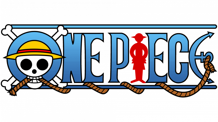
The iconic “One Piece” logo, conceptualized in 1999, strikes a perfect balance between captivating graphics and intelligent typography. The Straw Hat logo embodies Luffy’s ideals and values – freedom, loyalty, and an unwavering resolve to protect his friends. The hat itself holds sentimental significance as it once belonged to Luffy’s idol and former Pirate King, Gol D. Roger. By wearing the hat, Luffy pays tribute to the legendary pirate while forging his path to claim the title of Pirate King.
The Symbolism of the One Piece Logo Letters
Three key letters within the One Piece logo undergo visual transformations, adding depth and meaning to the design.
- The letter “O” in the One Piece logo prominently features a skull wearing a hat and gripping a rope in its teeth, paying homage to the classic Jolly Roger flag. Bones extend along the letter’s perimeter, contributing to its eerie allure. The hat is not merely an accessory but a symbol of hope, signifying Luffy’s determination to follow in his idol’s footsteps and fulfill the promise of becoming the Pirate King.
- A rope gracefully intertwines throughout the One Piece logo, anchored to the last letter “E,” cleverly stylized to resemble a ship anchor. Symbolizing the maritime essence of the pirate saga, the anchor imparts a sense of pirate adventure.
- The letter “I” in the One Piece logo takes on the silhouette of a man, likely representing the protagonist of the saga – Monkey D. Luffy, and adding a human touch to the emblematic visuals.
The letters, slightly elongated and voluminous, bear a bold and aggressive appearance. The inclusion of small serifs imparts a bold and assertive demeanor to the logo.
One Piece Logo Font
The font utilized in the One Piece logo is known as “One Piece” by Phantom King Graphics, presented in both uppercase and lowercase letters. Some individuals also perceive it to bear a striking resemblance to the “Anime Ace” style of typography.
Like many logos that heavily rely on typography to leave an impression on their audience, the One Piece logo font is a custom typeface specifically crafted for the anime’s distinctive identity.
Colors of the One Piece Logo
The color scheme of the “One Piece” emblem revolves around gradient blue, symbolizing the vastness of the sea, the primary setting of the saga. Complementing this, the logo incorporates various shades, each carrying its significance:
- Black and white depict the skull and bones, reinforcing the aura of danger and death.
- Yellow accents adorn the skull’s hat, which represents Monkey D. Luffy’s yellow hat.
- Red embellishments on the hat’s stripe and the silhouette provide a dash of intensity and excitement.
- Brown, representing the rope, exudes a pirate charm and maritime spirit.
One Piece logo colors codes:
| HEX | RGB | CMYK | PANTONE | |
| Red color from One Piece | #D70000 | (215, 0, 0) | (82, 31, 63, 13) | PMS 485 C |
| Black color from One Piece | #000000 | (0, 0, 0) | (60, 40, 40, 100) | PMS BLACK 6 C |
| White color from One Piece | #FFFFFF | (255, 255, 255) | (0, 0, 0, 0) | |
| Sky blue color from One Piece | #62C3F8 | (98, 195, 248) | (71, 61, 60, 60) | PMS 2915 C |
| Blue color from One Piece | #2E62A3 | (46, 98, 163) | (87, 13, 87, 9) | PMS 660 C |
| Yellow color from One Piece | #FFCD00 | (255, 205, 0) | (91, 99, 22, 22) | PMS 116 C |
| Brown color from One Piece | #AF6528 | (175, 101, 40) | (80, 44, 57, 35) | PMS 7573 C |
The Notorious Jolly Roger
At the heart of the “One Piece” logo lies the notorious Jolly Roger, a symbol universally associated with pirates and danger. The iconic image of a skull and crossbones against a black backdrop evokes a sense of fear and adventure. This enduring emblem has graced flags, logos, clothing, tattoos, and other pirate-related paraphernalia for centuries, with numerous variations emerging since the 1800s.
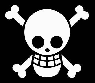
The exact origins of the Jolly Roger remain shrouded in mystery, but several theories have emerged over time:
- One hypothesis suggests that the name “Jolly Roger” comes from the French phrase “jolie rouge,” meaning “pretty red.” French pirates allegedly flew red flags, symbolizing their ferocity and merciless nature through the association with blood.
- Another version attributes the name to the French word “rogue,” denoting “swindler,” portraying pirates as cunning and deceptive figures.
- Alternatively, some researchers propose a connection with “Old Roger,” an old nickname for the Devil, implying a diabolical and menacing aspect to the pirate emblem.
Where to download the One Piece logo?
For those interested in using the One Piece logo themselves or delving deeper into its design elements, you can download the One Piece logo in different formats here.
One Piece logo Versions
Over the years, several versions of the One Piece logo have been introduced, each serving distinct purposes. In Japan, the logo includes the show’s Japanese name placed at the top of the emblem.
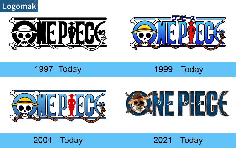
Another variation of the One Piece logo exists in black and white, catering to both Japanese and English adaptations of the official manga for the story.
As the One Piece franchise expanded, subsequent components adopted slightly modified versions of the logo. For instance, the initial “Shonen Jump’s” One Piece logo, utilized by 4Kids from 2004 to 2007, featured a different color scheme.
When Netflix took on the task of adapting the “One Piece” saga into a television series, they revamped the One Piece logo while retaining its distinctive identity. Launched in September 2021, the new branding preserves the color blue, the skull within the “O,” and the anchor-shaped “E.” However, designers introduced edgy techniques to enhance the One Piece logo’s appeal, including:
Embracing a simple and minimalist font devoid of serifs for a modern and clean look.
Presenting a photorealistic Jolly Roger with recognizable logo elements, such as the straw hat, rope, and human silhouette, adding depth and realism. Incorporating gilded shadows around the letters to elevate the One Piece logo’s realism and visual allure.
One Piece Pirate Flags: A Window into Pirate Crews
Throughout the “One Piece” manga and action series, various pirate team flags make appearances, each providing valuable insights into the respective pirate crews. Here are some notable examples:
Straw Hat Pirates

Featuring a smiling skull donning a straw hat, this flag represents the One Piece protagonist’s crew, exuding a friendly and adventurous spirit. This is one of the most famous anime logos.
Roger Pirates logo
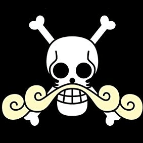
This flag pays tribute to the late king of pirates in One Piece, showcasing a lush curly mustache, an unmistakable trademark.
Red Hair Pirates
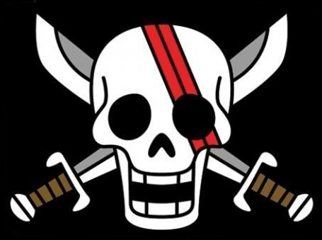
The Jolly Roger of the Red Hair Pirates mirrors their esteemed leader, Shanks, in a legendary display. The skull bears scars akin to those etched upon Shanks’ face, while their signature red color adorns the logo. Departing from the conventional crossbones, this pirate flag proudly showcases a pair of swords, symbolizing Shanks’ unparalleled swordsmanship in the world of One Piece.
Whitebeard Pirates logo
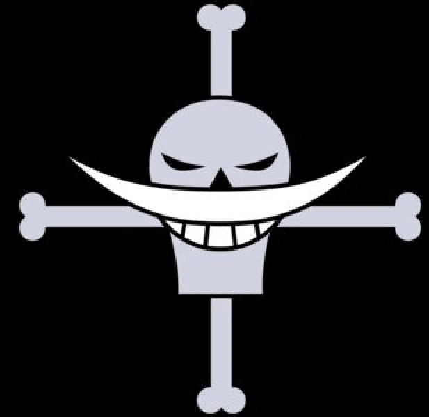
The Whitebeard Pirates hailed as one of the most legendary crews of all time, stand as the sole rivals to the mighty Roger pirates in One Piece. Their Jolly Roger proudly sports Whitebeard’s fierce mustache and a chilling grin on the skull mark. Interestingly, Roger and Whitebeard share a similar logo design for their Jolly Rogers, a detail that fans greatly admire.
Big Mom Pirates
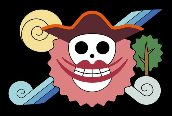
Recognizable by its female-themed design, including red lips and a pink background, this logo substitutes crossbones with lollipops, adding a whimsical touch.
Beast Pirates logo
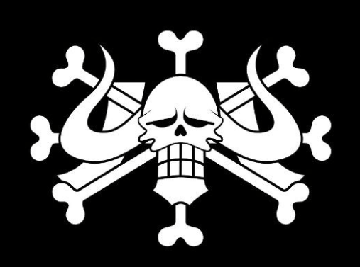
The Beast Pirates’ Jolly Roger strikes fear with its imposing depiction—a large skull adorned with Kaido’s menacing horns. The bones surrounding the skull create a chillingly cool effect, symbolizing the might and dominance of their captain, Kaido. This is one of the scariest logos at One Piece.
Buggy Pirates
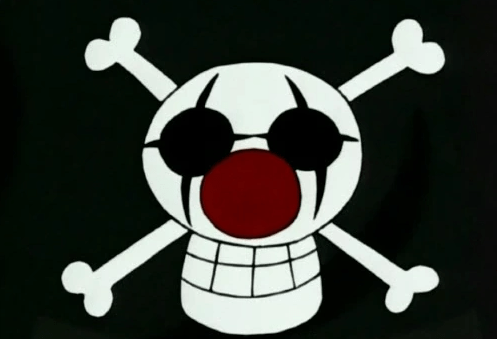
The Jolly Roger of the Buggy Pirates, like several others in One Piece, pays tribute to their captain. Adorned with clown makeup and a red nose, the skull exudes a playful and mischievous vibe, encircled by the familiar crossbones.
Blackbeard Pirates
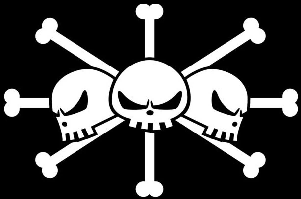
The Jolly Roger of the Blackbeard Pirates boasts three skull marks, each with a gaze fixated in different directions. A popular theory suggests that Marshall D. Teach, more widely known as Blackbeard, harbors three distinct personalities, granting him the ability to consume multiple fruits, thus adding to the enigmatic allure of their logo in One Piece.
Heart Pirates logo

Defying convention, the Heart Pirates’ Jolly Roger shatters the One Piece norms by omitting the traditional skull and bones. Instead, it showcases an entirely new and endearing logo design, featuring a smiley face integrated into a ship’s helm.
Kid Pirates
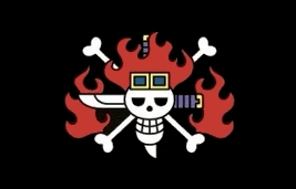
The One Piece Kid Pirates’ Jolly Roger faithfully mirrors their captain’s appearance. The skull mark dons flame-like hair, complemented by coolers or glasses atop its cranium, capturing the essence of Captain Kid’s charismatic persona.
Donquixote Pirates

Featuring a crossed-out smiley face, this logo signifies the end of an era, delivering a powerful message.
Kuja Pirates
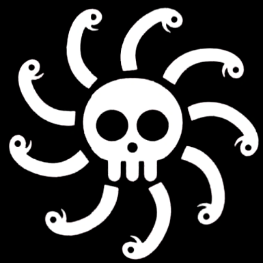
Nine snake heads encircling the skull capture the essence of the Pirates of Nine Snakes in One Piece, epitomizing curved lines and shapes.
Final thoughts
The “One Piece” saga’s diverse range of logos exemplifies how generic symbols can be transformed into unique and thrilling visuals. Applying this approach to your own company’s branding can yield captivating results. Take inspiration from a visual symbol connected to your business and enhance it with a couple of memorable elements, while maintaining a simple and easily comprehensible design. Remember, the power of branding lies in its ability to tell a compelling story and resonate with your audience. Try using Logomak to turn your knowledge into a real logo design right now.


