In the realm of animation and film, few logos are as recognizable and cherished as that of DreamWorks. The image of a little boy, perched on a crescent moon while fishing amidst a starlit sky, not only encapsulates whimsy but also the meticulous craftsmanship synonymous with the DreamWorks brand. Through the logo, DreamWorks narrates the tale of creative vision meeting cinematic excellence, echoing a journey of innovation and storytelling that has captured hearts worldwide. This emblem doesn’t just represent a studio; it symbolizes a dreamy voyage into the realms of imagination where every animation and film is an odyssey of color, emotion, and adventure.
The evolution of the DreamWorks logo mirrors the studio’s journey, reflecting the strides and changes it has undergone over the years. From its inception in 1994 by illustrious founders Steven Spielberg, Jeffrey Katzenberg, and David Geffen, DreamWorks has blossomed into a cornerstone of the modern film and animation industry. This article aims to reel you through the complete history of the DreamWorks logo, unveiling the narrative encapsulated in its design, color, and font. Each phase of its evolution not only marks a new chapter in the studio’s saga but also showcases the nuanced alterations in the emblem, making it more contemporary while retaining its iconic essence.
The voyage from the initial logo to the modern emblem embodies the studio’s commitment to creativity, modernity, and excellence. It’s a tale told through hues, shapes, and silhouettes, each tweak and change reflecting the studio’s pulse at that point in history. This article will navigate through the emblem’s evolution, analyzing the shifts in design and the ethos encapsulated in every iteration. Through the lens of the logo, we delve into DreamWorks’ rich legacy, unearthing the tale of a brand that has become synonymous with storytelling par excellence.
So, let’s embark on this narrative expedition, unearthing the aesthetic and conceptual metamorphosis of the DreamWorks logo, a brand emblem that has left an indelible mark on the canvas of the global animation and film industry.
Meaning and History
DreamWorks has entrenched itself as a powerhouse in the film and animation sector, and a significant fragment of its identity is enshrined in its logo. The logo isn’t merely a graphical emblem but a narrative, encapsulating the studio’s ethos and its illustrious journey.
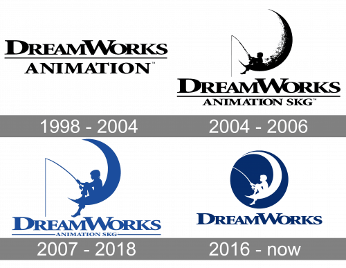
1998 – 2004

The inaugural logo of DreamWorks made its debut in 1998, capturing the essence of the studio’s name – a ‘dream’ seamlessly blending with ‘work’. The imagery of a young boy sitting on a crescent moon, fishing into the endless abyss represented the boundless realm of imagination and creativity the studio aimed to explore. The logo reflected a calm yet adventurous spirit, signaling the studio’s desire to delve into uncharted territories of storytelling. The animation sequence which unveiled this logo before the start of a film was as enchanting as it was symbolic. The calm night sky filled with stars, the gentle ripples in the water, and the serene expression of the boy, all encapsulated the magic that DreamWorks intended to sprinkle over its cinematic endeavors.
The color palette was simple yet evocative, with a soothing blue enveloping the scene, embodying a night filled with dreams and stories waiting to unfold. This logo was more than just a visual emblem; it was a promise of the adventure that awaited the audience, a testament to the studio’s relentless quest for creating memorable tales that resonated with a broad spectrum of audiences.
2004 – 2006

The period between 2004 and 2006 saw a subtle refinement in the logo’s design. While retaining the iconic imagery of the boy, moon, and the tranquil night, the logo underwent a slight refinement to keep up with the modern design tendencies of the time. The animation sequence became smoother, and the image appeared more polished, reflecting the studio’s continuous commitment to excellence and adaptation to contemporary aesthetics.
2007 – 2018
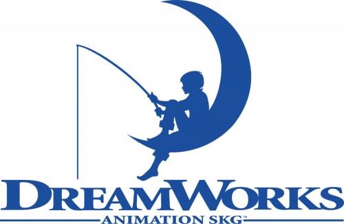
The stretch from 2007 to 2018 was marked by a more modern and polished appearance of the logo. The logo’s animation sequence was further refined, showcasing a sharper image and smoother transitions, embodying the studio’s journey towards a more modern and sophisticated identity. The color scheme subtly transitioned, yet retained the dreamy essence that was synonymous with DreamWorks. The emblem during this period reflected a perfect blend of tradition and modernity, symbolizing the studio’s ability to evolve while staying true to its roots.
2016 – Today
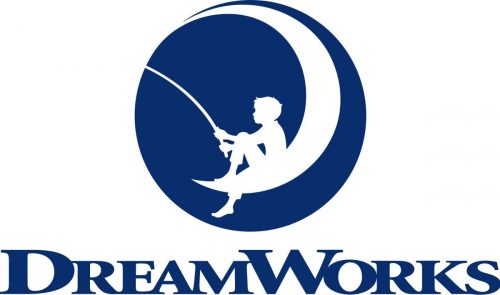
In 2016, a notable update was made to the DreamWorks logo, aligning it with the contemporary design ethos, yet preserving the emblematic imagery of the boy on the moon. The design saw a cleaner and more modern rendition, with sharper lines and a refined animation sequence. This period also witnessed the logo adapting to various thematic elements of the movies it preceded, showcasing a dynamic branding strategy. Each adaptation of the logo carried a unique charm, yet reverberated with the iconic imagery that has become synonymous with cinematic excellence and imaginative storytelling that DreamWorks is celebrated for.
Logo Emblem Details
The emblematic portrayal of a young boy, seated on a crescent moon with a fishing rod in hand, is a visual voyage that has been etched into the hearts of many. This timeless image isn’t just a fanciful representation, but a meticulously crafted emblem that resonates with the core values and the narrative of DreamWorks studio.
The boy on the moon is an embodiment of the boundless creativity and imagination that is the hallmark of DreamWorks. The scene is serene yet filled with the promise of adventure, much like the studio’s vast array of films and animations that transport audiences to realms hitherto unexplored. The fishing scenario is a metaphor for delving into the ocean of imagination to reel in stories that captivate and inspire. It’s a beautifully simple yet profound imagery that defines the essence of DreamWorks.
The emblem also encapsulates the studio’s commitment to pushing the boundaries of conventional storytelling, exploring new horizons with each project. The tranquility of the scene juxtaposed with the hint of untold adventures encapsulates the dual nature of DreamWorks’ storytelling ethos – blending the serene with the spectacular, the heartfelt with the adventurous.
The design of the emblem has undergone subtle refinements over the years, each iteration reflecting the contemporary design sensibilities while staying true to the original concept. The emblem’s evolution is a testament to DreamWorks’ ability to adapt and evolve, keeping the brand relevant and cherished across generations.
Moreover, the choice of keeping the emblem essentially unchanged over the years reflects a brand continuity that’s both comforting and reassuring to the audience. It reiterates DreamWorks’ steadfastness in its mission to continue being a source of imaginative and engaging storytelling.
The emblem isn’t just a logo; it’s a visual story, a promise of the imaginative voyage awaiting the audience whenever they see the DreamWorks name on the screen. It’s a masterful blend of simplicity, elegance, and narrative, making it one of the most iconic and beloved logos in the film and animation industry.
Logo Colors Details
The color scheme of the DreamWorks logo is simplistic yet profoundly evocative, creating a calm and dream-like ambiance that perfectly aligns with the studio’s name and its storytelling ethos. The primary colors used in the emblem play a crucial role in conveying the brand’s identity and the emotional resonance it aims to achieve with its audience.
Blue
The predominant blue hue in the logo evokes a sense of calm, serenity, and infinite possibilities. The night sky illuminated by a smattering of stars provides a perfect backdrop for the young boy’s quiet yet imaginative endeavor. Blue also symbolizes trust and dependability, traits that are synonymous with the DreamWorks brand. Over the years, the shade of blue has seen subtle shifts, aligning with contemporary design aesthetics while retaining its essential tranquility and dreaminess.
White
White is the other significant color in the logo, primarily featured in the moon and the stars. It symbolizes purity, innocence, and potential, mirroring the boundless creativity and the unchartered territories the studio ventures into with each new project. The white crescent moon is not just a visual element but a canvas of imagination, embodying the studio’s ethos of exploring the unknown.
Black
The use of black in the logo, especially in the silhouette of the boy, adds a touch of mystery and intrigue. It creates a beautiful contrast against the blue and white, adding depth and focus to the emblem. The silhouette also symbolizes the universal nature of DreamWorks’ storytelling, appealing to the inner child in everyone, regardless of age or background.
The color scheme of the DreamWorks logo is a beautiful blend of simplicity and symbolism. It’s a testament to the power of color in conveying a brand’s identity and the emotions it wishes to evoke. Each hue in the logo has been chosen with meticulous consideration, ensuring it aligns with the brand’s narrative and the emotional journey it promises to its audience with every film and animation it releases.
Logo Font Details
The font used in the DreamWorks logo plays a pivotal role in embodying the brand’s identity and professionalism. Over the years, the typography has seen refinements to reflect contemporary design trends while maintaining a timeless elegance that resonates with the DreamWorks brand. Here’s a closer examination of the font details and the subtleties that make it an integral part of the logo’s appeal.
Simplicity and Elegance
The font used in the DreamWorks logo is simplistic and elegant. It doesn’t overshadow the iconic imagery of the boy on the moon but complements it, ensuring a harmonious and balanced visual appeal. The clean lines and uncomplicated design of the typography reflect the studio’s commitment to clarity, precision, and professionalism.
Readability
Readability is a key feature of the DreamWorks logo font. The letters are clear, crisp, and easy to read at a glance, making the logo instantly recognizable. This aspect of the font design is crucial as it ensures the brand name is easily discernible, aiding in brand recall and recognition.
Modernity
Over the years, the font has been updated to reflect modern design sensibilities. The subtle tweaks in the typography ensure it stays relevant and appealing to contemporary audiences. However, the changes have always been done tastefully, ensuring the timeless essence of the original design remains intact.
Brand Consistency
The consistency in font style over the years reflects a strong brand identity. Despite the subtle updates, the essence of the typography has remained unchanged, showcasing DreamWorks’ commitment to maintaining a strong and consistent brand identity.
5 Frequently Asked Questions about the DreamWorks logo
- What does the DreamWorks logo represent?
The DreamWorks logo, depicting a boy sitting on a crescent moon while fishing, embodies a sense of whimsy, imagination, and dream-like creativity which aligns with the studio’s ethos of bringing imaginative stories to life.
- Who designed the DreamWorks logo?
The logo was designed by Robert Hunt, who was commissioned to bring Steven Spielberg’s idea of a man fishing from the moon to life. However, it was Hunt’s suggestion to replace the man with a young boy.
- When was the DreamWorks logo created?
The DreamWorks logo was created in 1994, around the time when the studio was founded by Steven Spielberg, Jeffrey Katzenberg, and David Geffen.
- How is the DreamWorks logo animated in films?
The logo is often animated in a way that transitions smoothly into the opening scene of a film. The animation showcases the boy casting his fishing line into the water, which often leads to the beginning of the story.
- Has the DreamWorks logo received any design awards?
While there isn’t public information on specific awards for the logo, it’s widely recognized and appreciated for its unique, imaginative design.
Conclusion
The font, though a seemingly small aspect of the logo, plays a significant role in conveying the brand’s identity and values. Its simplicity, readability, and modernity, coupled with the iconic emblem of the boy on the moon, work together to create a logo that’s not only visually appealing but also rich in narrative and brand consistency. Through meticulous design choices in its font, color, and emblem, the DreamWorks logo stands as a testament to the studio’s dedication to excellence, innovation, and a unique storytelling ethos, making it a cherished icon in the realm of film and animation. Create your own logo right now using Logomak.

