Ever delved into the tale behind the Domino’s logo? For the pizza aficionados among us, the classic Domino’s emblem might ring a familiar bell. Yet, the backstory of this emblem, and its link to pizza, remains an enigma to many.
Now standing tall as one of the global titans in the pizza realm, Domino’s boasts a logo that’s etched in the minds of pizza lovers far and wide. The red and blue domino icon has elegantly baked its way into the fast-food tapestry worldwide.
Curious about the journey of the Domino’s logo or the narrative behind its contemporary avatar? You’ve just landed on the right page. Let’s slice into the chronicle of the Domino’s emblem, unearthing its journey from inception to becoming the pizza icon it is today.
The Birth of a Pizza Legend: Welcoming Domino’s
Emerging onto the scene in 1960, Domino’s, originally Domino’s Pizza, has risen to become a revered name in the pizza landscape. Boasting a network of around 15,000 outlets as of 2018, it’s clinched its spot among the global pizza moguls. On its home turf in the US, it’s nestled comfortably among the top trio of pizza behemoths, in terms of revenue generation.
The saga of Domino’s emblem embarked alongside the inception of the company in 1960, when Tom Monaghan partnered with his sibling James to acquire a quaint pizzeria named “DomiNick’s.”
Fast forward to 1965, the duo had already annexed two more pizzerias to their venture, aiming for a unified brand identity. However, the moniker DomiNick posed a hurdle, as it was already claimed.
Enter Jim Kennedy, an insightful employee, who pitched the name “Domino’s.” The suggestion struck a chord with Monaghan, prompting the official rechristening of the trio of pizzerias. The newly minted logo, adorned with three dots, symbolized the trio of outlets.
Initially, the aspiration was to append a dot with the inauguration of each new outlet, a concept that was retired swiftly as the franchise burgeoned.
Tracing the Logo Legacy of Domino’s: A Journey of Iconic Transformations
The emblem of Domino’s Pizza has gracefully evolved through time, yet certain design threads have remained intertwined with its identity since the dawn of its new name. Let’s delve into the fascinating odyssey of Domino’s logo metamorphosis.
1960

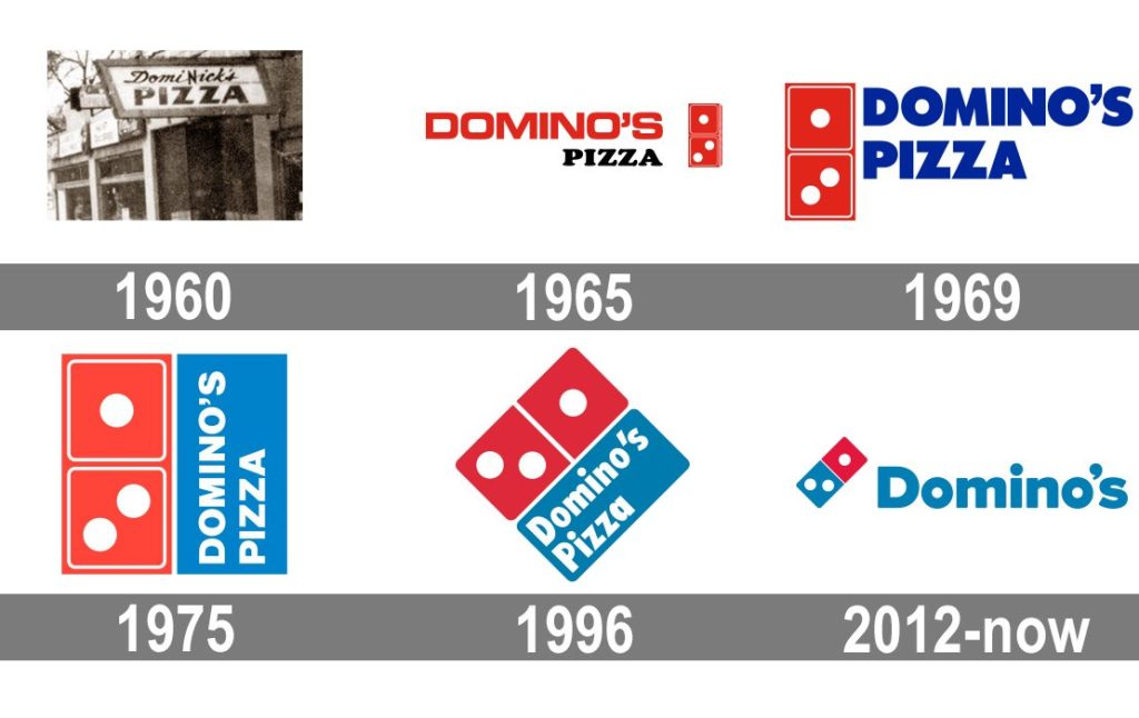
As the entrepreneurial brothers embarked on their pizza venture, the original guise of DomiNick’s Pizzeria held its ground momentarily. The emblem boasted a two-tiered wordmark, each tier flaunting a distinct font style.
While the upper tier emanated a hand-crafted aura, the word “Pizza” was etched in a bold, sans-serif font, emanating a sense of robustness with its wide letters.
1965
With a fresh name for their burgeoning pizza empire, Domino’s unveiled an emblem that mirrored the new moniker.
The name “Domino’s” was perched on top in a bold, crimson, all-cap font, while “Pizza” was nestled below in elegant serif typography, also in uppercase.
Adjacent to the wordmark, on the right, sat a 3-dimensional red domino, its three white dots symbolizing the trio of outlets.
1969
As the late 60s rolled in, Domino’s spruced up its visual identity, infusing new hues and a sleeker demeanor into its emblem. The design morphed into a more modern and compact avatar, with the text gracefully aligning to the right of the domino symbol.
Though retaining its two-tiered layout, the emblem exuded a contemporary vibe. The domino, still a part of the design, transitioned into a two-dimensional figure, with colors now radiating a more vibrant charm.
1975
The year 1975 saw the logo morph once again, nesting the brand name within a blue box, against a white font backdrop, accompanied by the iconic domino. The emblem transformed into a square, reminiscent of a pizza box, with the wordmark taking a rotation.
A subtle shift in the blue hue towards a brighter, softer spectrum, subtly toned down the contrast between the two key elements.
1996

In 1996, a refined guise emerged as the box tilted slightly, enhancing the legibility of the wordmark. The text saw a modest tweak, with only the ‘P’ and ‘D’ standing tall in uppercase. The square’s corners softened, rounding off to a friendlier appeal.
Though the emblem still resonated with the imagery of pizza boxes, a hint of a diamond silhouette symbolized a hallmark of quality.
2012
Come 2012, a global rebranding initiative ushered in the latest rendition of the Domino’s logo. The title shed the “Pizza” tag, paving the way for a sleeker image.
As Domino’s diversified its menu, the simplification resonated with its broader food offerings. The domino motif saw a color shift in one of its components from red to blue, offering a distinctive contrast. In certain renderings, the emblem stands solo, sans the wordmark, leaving the domino to speak for the brand’s legacy.
The Trilogy of Dots in Domino’s Emblem: What’s the Story?
Amidst the myriad queries surrounding the choices in Domino’s logo, the tale of the three dots perhaps reigns supreme. Dominos, after all, are a canvas of varied dot amalgamations, so why the trio? The answer lies nestled in the brand’s humble beginnings.
As the Domino’s cohort embraced their new identity, the domino insignia was envisioned to bolster brand recognition and resonance. The trio of dots was not a random choice, but a homage to the brand’s three bustling outlets at the time.
Though whispers of dot additions with each new outlet did flutter about, the brand’s meteoric rise soon shelved this quaint idea into the annals of history.
The Color Palette of Domino’s Emblem: A Symbolic Dichotomy
The modern-day Domino’s logo stands as a quintessence of simplicity yet commands a potent imprint on the fast-food cosmos. Even in the absence of its wordmark, the domino design instantly whisks one’s mind to the doorstep of Domino’s.
The logo’s color essence even cascades onto Domino’s packaging, with the red and blue hues enshrining the pizza boxes.
The duet of colors in the Domino’s emblem orchestrates a vivid contrast that’s not just eye-catching and memorable, but also discernible from afar. The color red, often reminiscent of the zest in pizza sauce and the warmth of the oven, also stirs the appetite. This hue, traversing beyond the culinary realm, often evokes notions of power and fervor.
On the flip side, blue unfurls a narrative of strength and trustworthiness, anchoring the brand in a semblance of reliability and consistency.
Unraveling the Typography in Domino’s Emblem: Which Font Graces the Logo?
The Domino’s logo has seen a tapestry of typefaces grace its emblem through the years. The latest incarnation hosts a font reminiscent of the Futura genre, crafted by Paul Renner. This sleek, contemporary, and sans-serif font unfurls a vibe of friendliness and accessibility, embodying the brand’s approachable ethos.
Frequently Asked Questions About the Adidas Logo
- When was the original Domino’s logo created?
The original Domino’s logo was created in 1960, the year the company was founded. - What do the three dots on the logo symbolize?
The three dots on the Domino’s logo symbolize the first three stores the restaurant chain had in 1965. - Why was the word “Pizza” removed from the logo in 2012?
By 2012, Domino’s had developed a very extensive menu, so it was decided to remove the word “pizza” from the emblem to reflect the broader menu offerings. - Who were the founders of Domino’s Pizza?
Domino’s Pizza was founded by Tom Monaghan and his brother, James, in 1960 in Michigan. - Has the Domino’s logo always had a domino piece in its design?
Yes, the logo has always featured a domino piece, symbolizing the name of the company and its early history of store openings.
Delving into the Essence of the Domino’s Emblem: What Does the Symbol Convey?
A voyage through the annals of Domino’s logo lore unveils a rich narrative of the brand’s metamorphosis. The emblem that graces our eyes today is a refined descendant of the initial visual persona adopted upon the christening of its new moniker.
The moniker “Domino” propelled the venture to encapsulate a domino within its emblematic identity, the trio of white dots paying homage to the three inaugural outlets.
Emblazoned in a palette of white, red, and blue, the emblem resonates with notions of purity, vigor, ardor, and dependability. These hues, vibrant yet harmonious, beckon with an aura of approachability. The emblem’s geometric simplicity not only etches a memorable imprint but also exudes a timeless modernity, ensuring its resonance through the annals of time.
Do you need a logo for your own company? Create it in minutes with Logomak.


