When it comes to creating a unique brand identity, choosing the perfect logo font is crucial. This selection can significantly impact how the audience perceives the brand. In this comprehensive guide, we will explore 40 prime logo fonts and provide insight into selecting your ideal type for a memorable brand representation.
4 Main Types of Fonts for Logo Design
Understanding the different font styles is pivotal as each carries a distinct vibe and can significantly affect the logo’s visual appeal. Let’s break down the four core logo font styles that are commonly used across various industries.
Serif Logo Fonts
Serif fonts are characterized by small lines or strokes attached at the end of letters. They are often seen as traditional, reliable, and professional. Brands that aim for a classic, trustworthy image often gravitate towards serif fonts. An example of a serif logo font is Times New Roman, which has been a staple in the print industry for decades.
Sans Serif Logo Fonts
Sans serif fonts, as the name suggests, lack the small lines that serif fonts have. They are seen as modern, clean, and straightforward. Brands aiming for a minimalist or modern image often opt for sans serif logo fonts. Helvetica is a notable sans serif font that exemplifies simplicity while maintaining a professional look.
Script Logo Fonts
Script fonts are elegant and stylish, mimicking handwritten cursive text. They are perfect for brands that want to convey elegance, creativity, or a personal touch. Script fonts like Pacifico or Dancing Script can add a distinctive charm to a logo, making it stand out in a crowded market.
Display Logo Fonts
Display fonts are the most diverse and creative font style. They come in various forms and are often used for logos that aim to be unique, playful, or innovative. Display fonts can range from the whimsical (like the font Jokerman) to the geometric and modern (like Futura). They are great for brands that aim to make a bold statement with their logo design.
How Many Fonts to Use in the Logo?
Choosing the right number of fonts to use in a logo is essential for maintaining clarity and creating a harmonious design. Let’s delve into how you can strike a balance between variety and consistency in your logo design.
Utilizing more than one font can add a dynamic flair to your logo, but it requires a thoughtful approach to ensure the fonts complement each other well. Here are some guidelines:
- Contrast but Complement: Choose fonts that are distinctly different but still complement each other. For instance, pairing a serif font with a sans serif font can create a pleasing contrast.
- Maintain a Common Trait: Ensure that the fonts share a common trait, be it the letter width, height, or style to maintain a cohesive look.
- Hierarchy: Establish a clear hierarchy between the fonts used. Typically, the brand name should be more prominent, while the tagline or additional information can be in a subtler font.
How to Choose the Perfect Logo Font?
The font you choose for your logo is not merely a design decision but a reflection of your brand’s personality and values. Here are some critical considerations to ensure your logo font aligns well with your brand ethos.
1. Aligning with Brand Personality
Your logo font should resonate with your brand’s personality. Whether you’re aiming for a modern, traditional, edgy, or elegant vibe, the font should embody these characteristics.
2. Resonating with Target Audience
Understanding your target audience’s preferences and expectations is crucial. Choose a font that appeals to them while also standing out among competitors.
3. Ensuring Legibility
Legibility is paramount. Your audience should be able to read the logo effortlessly, irrespective of where it’s displayed.
4. Considering Scalability
A good logo font works well in various sizes. It should remain legible whether it’s on a business card or a billboard.
5. Color Independence in Logo Fonts
The color palette chosen for a brand’s logo is undoubtedly crucial, but the font must retain its effectiveness in a variety of color settings or even in black and white. Let’s dive into why color independence is vital and how to achieve it.
Color independence ensures that the logo remains impactful and legible across diverse platforms and backgrounds, increasing brand consistency and recognition.
Using Logomak you can find the perfect font for your logo. Just enter your company name and choose the type of business activity and Logomak with pick great fonts for your logo in a seconds.
40 Best Logo Fonts for Memorable Logos
In the quest for the perfect logo font, exploring some exemplary fonts used by successful brands can provide valuable insights. Here, we feature 40 stellar logo fonts that have stood the test of time or are making waves in the modern branding arena.
Time-Tested Logo Fonts
These fonts have been embraced by brands over the years for their versatility, legibility, and aesthetic appeal.
1. Helvetica
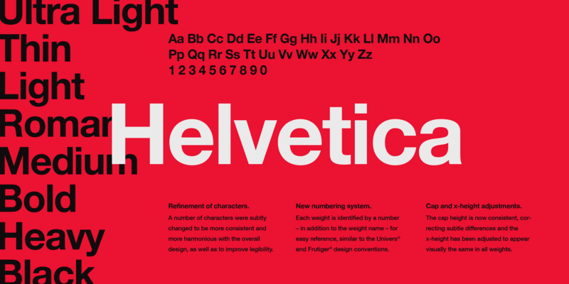
Helvetica is a widely used sans-serif typeface developed in 1957 by Swiss typeface designer Max Miedinger. It’s known for its clean, simple, and neutral design, making it a versatile choice for a broad spectrum of branding applications.
2. Futura
Futura is a geometric sans-serif typeface designed by Paul Renner in 1927. Its modern design, characterized by geometric shapes, represents forward-thinking and modernity, making it a popular choice among innovative and tech-oriented brands.
3. Garamond
Garamond is a group of many serif typefaces, named for sixteenth-century Parisian engraver Claude Garamond. It’s known for its elegance, readability, and timeless quality, making it a preferred choice for both print and digital media.
4. Proxima Nova
Designed by Mark Simonson in 2005, Proxima Nova bridges the gap between typefaces like Futura and classic sans fonts. Its modern geometric style mixed with humanist traits makes it a versatile, modern, and friendly font.
5. Avenir
Avenir is a geometric sans-serif font designed by Adrian Frutiger in 1988, which means “future” in French. It combines the spirit of Futura with a more humanist touch, making it a warm and modern font.
6. Bodoni
Designed by Giambattista Bodoni in the late eighteenth century, Bodoni is a serif typeface known for its high contrast between thick and thin strokes, which gives it a luxurious and timeless feel.
7. Didot
Didot is a group of typefaces named after the famous French printing and type producing Didot family. The high contrast and distinctive style make it a go-to for luxury and high-fashion branding.
8. Univers
Univers is a neo-grotesque sans-serif typeface designed by Adrian Frutiger in 1954. It’s highly legible and comes in a wide variety of weights and styles, making it a flexible choice for many branding needs.
9. Montserrat
Montserrat is a modern, geometric sans-serif font inspired by the old posters and signs in the traditional Montserrat neighborhood of Buenos Aires. Its urban, contemporary design makes it suitable for a wide range of modern brands.
10. Gotham
Gotham is a geometric sans-serif typeface designed by Tobias Frere-Jones in 2000. It’s known for its broad design and versatile nature, making it a popular choice among professional and modern brands.
Modern Logo Fonts
In addition to the time-tested fonts, there are emerging and contemporary fonts that are gaining traction for their innovative and modern design. These fonts are excellent choices for brands looking to establish a fresh and modern identity.
11. Raleway
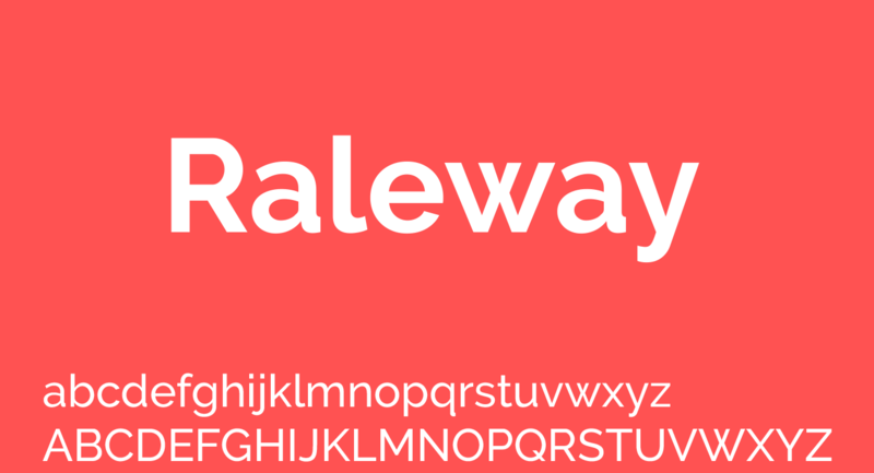
Raleway is an elegant, sans-serif typeface family intended for headings and other large size usage. Its sleek design makes it a good choice for modern, clean designs.
12. Poppins
Poppins is a geometric sans-serif font that combines the modernism of geometric fonts with the fluidity of grotesque designs, making it a fresh, futuristic, yet readable font.
13. Roboto Slab
Roboto Slab is a versatile serif typeface with a modern structure. It maintains a natural reading rhythm while still showing a modernist, geometric form.
14. Quicksand
Quicksand is a sans-serif font with rounded terminals, which is excellent for a soft, friendly, and modern look.
15. Nunito Sans
Nunito Sans is a well-balanced sans-serif typeface superfamily, with 2 versions: The project began with Nunito, as a terminally rounded sans serif for display typography.
16. Recoleta
Recoleta is a soft serif font that combines the retro and the modern, making it a perfect choice for brands looking to convey tradition in a contemporary light.
17. Orelo
Orelo is a modern, clean, and versatile font family. Its geometric construction makes it an ideal choice for brand identities, UI/UX design, and more.
18. Canela
Canela is an elegant serif typeface that blends traditional serif forms with the often contrasting aesthetics of contemporary design.
19. Agentur
Agentur is a contemporary serif font with distinctive, bold characters, making it a standout choice for modern brands looking to make a statement.
20. Separat
Separat is a modernist, experimental font with unique characters, offering a dynamic choice for brands looking to step outside traditional font choices.
Bold Logo Fonts
21. Bebas Neue
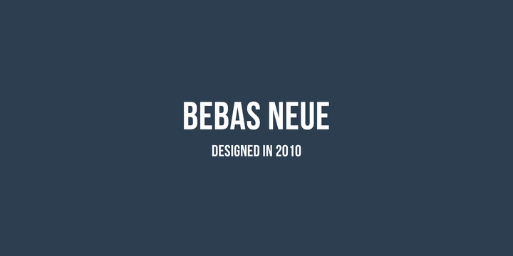
A tall, bold typeface, Bebas Neue is excellent for creating a modern, impactful look.
22. Aleo
Aleo is a contemporary slab serif font that offers a sleek, professional appearance.
23. Playfair Display
With its high contrast and distinctive style, Playfair Display is great for a sophisticated, classic look.
24. Lobster
Lobster is a bold script font that adds a touch of elegance and flair.
25. Alfa Slab One
This is a contemporary take on a classic slab serif design, adding a bold, robust character to logos.
26. Oswald
Oswald is a modern reworking of the classic gothic font style, perfect for creating a strong, modern identity.
27. Anton
Anton is a reworking of traditional advertising sans serif typefaces, providing a modern and strong appearance.
28. Righteous
Righteous is a geometric font with a modern design, making it great for tech or innovative brands.
29. Satisfy
Satisfy gives a sleek and professional cursive look, ideal for creating an elegant brand image.
30. Impact
As the name suggests, Impact is a high-visibility and bold font, perfect for making a strong statement in logos.
Elegant Logo Fonts
31. Cormorant Garamond
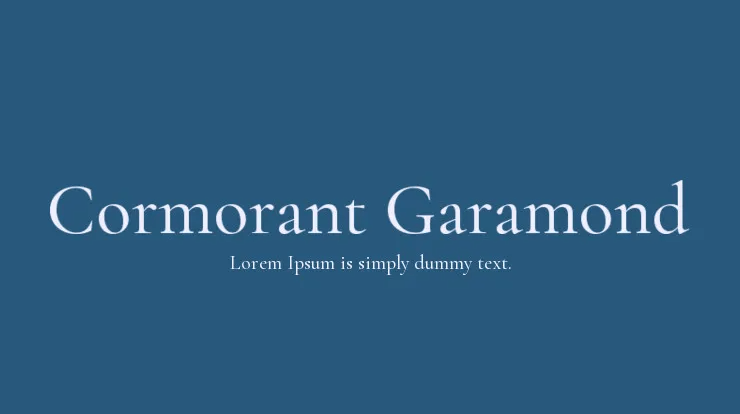
This is an elegant, old-style serif font that brings sophistication to any logo design.
32. Arvo
Arvo is a geometric slab-serif font family suited for both screen and print, and it’s known for its elegance and modern design.
33. Merriweather
Merriweather is a high readability serif font, designed for a pleasant reading experience on screens.
34. Lora
Lora is a well-balanced, modern serif font with roots in calligraphy, making it elegant and readable.
35. Josefin Sans
With a geometric, elegant design, Josefin Sans is a modern, stylish choice for a variety of branding needs.
36. Rokkitt
Rokkitt is a modern, elegant serif font with a classic vibe, perfect for brands looking for a sophisticated, timeless look.
37. Quattrocento
Quattrocento is a classic, elegant serif font that brings a touch of sophistication.
38. Old Standard TT
Old Standard TT is a modern serif font with a classic design, making it a timeless choice for a sophisticated brand image.
39. Vollkorn
Vollkorn is a serif font with a strong, classic look, bringing a touch of elegance and tradition.
40. Alegreya
Alegreya is an elegant, sophisticated serif font with a warm, dynamic design, making it a beautiful choice for a variety of branding purposes.
You can download logo fonts on Google fonts or Font Space.
Key Takeaways
The process of choosing the right logo font is a nuanced one, with far-reaching implications for a brand’s identity and recognition. Here are some key takeaways from our exploration of logo font choices:
- Align with Brand Personality:
Your logo font should be a visual extension of your brand’s personality. Whether your brand is modern, sophisticated, playful, or traditional, the font should reflect these traits accurately.
- Prioritize Legibility:
No matter how aesthetically pleasing a font is, if it’s not legible across different mediums and sizes, it won’t serve its purpose effectively. A legible font ensures that your audience can easily identify and remember your brand.
- Consider Industry Standards:
While it’s vital to stand out, adhering to industry typography standards can foster trust and professionalism. Observing the typography trends within your industry can provide valuable insights.
- Test Across Different Platforms:
Before finalizing your logo font, test it across different platforms to ensure it remains impactful and legible whether on a website, a business card, or a billboard.
- Gather Feedback:
Collecting feedback from stakeholders, potential customers, and design professionals can provide diverse perspectives and help refine your logo font choice.
- Seek Professional Guidance:
If you’re unsure, consulting with design professionals can be invaluable. Their expertise can help align your font choice with your brand identity and industry standards.
- Experiment with Font Pairing:
Pairing fonts can enhance visual interest and convey a brand’s versatility. Experiment with different font pairings to find what resonates best with your brand’s message and audience.
- Stay Open to Evolution:
As your brand grows and evolves, so too might your typography needs. Stay open to the possibility of revisiting and possibly updating your logo font to align with any changes in your brand’s positioning.

