Meaning and History
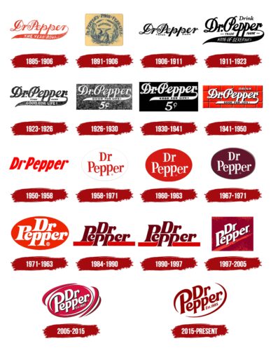
Since its creation, the Dr Pepper logo has etched a significant mark in the beverage industry. As it traversed time, its logo – the face of its brand – evolved in tandem with global design trends, ever mirroring its commitment to quality and innovation. Let’s embark on a detailed journey, traversing the rich history and myriad changes this logo has witnessed over the years.
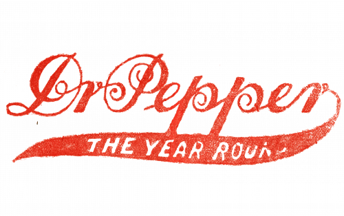
1885 – 1906 Dr Pepper Logo

The brand’s foundational years presented the pepper logo in its simplest form. Using white letters set against a compelling cherry background, this logo looked polished and was the brand’s maiden handshake with the world. For many, this design reflected the drink’s straightforward, no-frills approach, focusing on taste and quality.
1891 – 1906

As the world neared the turn of the century, the need for branding became evident. The pepper logo underwent a meaningful redesign, introducing a more pronounced inscription, thereby granting the pepper emblem its rightful prominence. Simultaneously, the background hue shifted to a darker shade, subtly alluding to the drink’s deeper, robust cherry undertones.
1906 – 1911 Dr Pepper Logo

The 20th century unfurled a brand eager to refresh its image. The logo colors incorporated a poignant dark red for the emblem, with a complementary white inscription. The lettering saw tweaks, with elongated characters, most notably the tail of the “p” in “pepper”, which stretched out elegantly, refining the overall look.
1911 – 1923 Dr

The Roaring Twenties saw another emblematic switch. Introducing an encompassing oval contour around the pepper emblem, the brand infused a badge-like charisma. The choice of serif as the typeface injected a degree of authority and gravitas, making the pepper logo synonymous with trustworthiness.
1923 – 1926 Dr Pepper Logo

This brief period marked a transition towards cleaner, more vibrant aesthetics. The emblem received a wash, streamlined to flaunt a delicate script font. The cherry-red background shade emerged clearer, providing a refreshing contrast to the white letters. It was a time when the pepper logo breathed with a newfound vivacity.
1926 – 1930

These years witnessed a bolder design iteration. The wordmark found itself comfortably placed on a two-toned background. Red, signifying energy and passion, claimed the upper half, while a darker, grounding shade anchored the lower half. This dichotomy in the logo brought forth the brand’s dynamism, appealing to a wider audience.
1930 – 1941 Dr Pepper Logo

In alignment with the brand’s evolving communication strategy, the pepper logo welcomed the tagline “good for life.” Positioned right beneath the wordmark, it reinforced the beverage’s promise of unmatched quality and invigorating taste, making each sip a testament to life’s good moments.
1941 – 1950

The post-war era brought with it a desire for rejuvenation. Reflecting this sentiment, the pepper emblem adopted a sunny disposition. The background color palette is now danced with shades of yellow, interspersed with classic red. This optimistic imagery was set off by a consistent white inscription, giving the logo a modern flair.
1950 – 1958 Dr Pepper Logo

A leap into the atomic age, the 1950s pepper logo portrayed a futuristic vibe. An arresting dark red contour, which traced the wordmark, became its standout feature. This emblem, placed boldly against a pristine white background and paired with a crisp san-serif font, encapsulated the era’s progressive spirit.
1958 – 1960

This interlude ushered in a return to vintage aesthetics. The pepper logo reincarnated the badge-like emblem, marrying the cherry background with centrally placed white letters. A harmonious blend of old-world charm and contemporary finesse, the design spoke volumes of the brand’s rich lineage.
1960 – 1963 Dr Pepper Logo

An era of nostalgia, these years witnessed the revival of the elongated “p” tail in the pepper logo. While the emblem maintained its core essence, subtle redrawing efforts enriched the color, making the red hue deeper, more alluring, akin to a cherished memory.
1963 – 1971

During this stretch, the pepper logo retained its familiar design but with a notable addition. The tagline “Good for life” made a grand comeback, placed right under the emblem, reaffirming the brand’s age-old promise and commitment to its consumers.
1971 – 1984 Dr Pepper Logo

In a world of disco-dancing into modernity, the logo saw a fresh redesign. Now sporting an arch elegantly stretched over the wordmark, the pepper emblem radiated contemporary coolness, capturing the essence of both its rich history and the era’s zest.
1984 – 1990

The 80s, a period of vibrant pop culture, influenced the Pepper logo redesign. Harking back to previous renditions but with a brighter red background, the clean white inscription appeared as a nod to both nostalgia and a look toward the future.
1990 – 1997 Dr Pepper Logo

This decade brought with it a new brand message. Under the pepper emblem, the words “Always One of a Kind” made their debut. This refreshed design and tagline highlighted the brand’s unique positioning in the saturated beverage market.
1997 – 2005

As we approached a new millennium, the pepper logo exuded confidence with its bold wordmark set against a dark, passionate red background. This iteration celebrated the brand’s enduring legacy, standing tall amid fleeting market trends.
2005 – 2015 Dr Pepper Logo

This era birthed a sleek, sophisticated design. The pepper logo was sharper, showcasing a pristine white background paired with a vibrant dark red wordmark. The understated tagline placement added to its elegance, encapsulating the brand’s mature evolution.
2015 – Today

Today, the Pepper logo is a masterful amalgamation of its storied history and cutting-edge design principles. Dominated by hues of red and white, the emblem stands as a testament to its legacy, promising a taste and quality that resonates with generations.
Emblem
The Dr Pepper emblem is more than a mere design element. It’s a legacy, a story, an emblematic representation of a brand that has quenched thirsts and won hearts for over a century. The emblem’s evolution, from simple wordmarks to intricate designs, chronicles its unwavering commitment to its audience.
Font
Typefaces are the silent ambassadors of brands, and the Dr Pepper logo is a testament to this. The journey from classic serif to contemporary san-serif narrates a brand story of adaptability, growth, and keen market understanding. Each font change complemented the emblem, ensuring that the pepper logo remained a beloved icon.
Color
Colors breathe life into logos. The Dr Pepper logo, with its dominant reds, clean whites, and occasional yellows, tells a tale of passion, purity, and optimism. Over the years, varying shades of red have graced the logo, but its significance in the brand’s narrative remains unwavering, painting a picture of a brand both timeless and contemporary.

5 Interesting Facts About Dr Pepper logo
- Timeless Consistency: Throughout its history, while other brands underwent drastic redesigns, the Dr Pepper logo evolved subtly, ensuring its iconic elements remained recognizable to its audience.
- Cherry-Red Connection: The logo’s signature cherry-red color not only makes it stand out but is a subtle nod to the unique 23-flavor profile of the drink, including the prominent cherry taste.
- Missing Period Mystery: One of the quirky features of the Dr Pepper brand is the intentional omission of the period after “Dr” in its name. The period was dropped in the 1950s for a cleaner design, and this distinct style has been maintained ever since.
- The Color Palette’s Story: Beyond the cherry red, other recurring colors in the logo, like white and black, have played a significant role in emphasizing contrast and ensuring legibility across various mediums.
- Influences of Pop Culture: At various times, tweaks in the Dr Pepper logo have mirrored popular culture and design movements, making it a brand that both influences and is influenced by the zeitgeist.
Curious about the stories of other famous logos? Discover their stories here.
Final words
The Dr Pepper logo, much like its tantalizing flavor, has seen an evolution that both intrigues and impresses. It’s a testament to how a brand can traverse time, adapting and reinventing while remaining true to its core essence. As we sip on this iconic beverage, we’re not just relishing a drink, but also savoring over a century’s worth of branding genius, heritage, and commitment to quality. Each logo redesign has been a chapter in this riveting tale, and as the current logo stands today, it promises the continuity of this legacy for future generations. Ready to create your own logo? Do it right now with Logomak.


