The invention of the telephone in 1869 by Alexander Graham Bell marked the genesis of a communication revolution. The same can be said about the AT&T logo. Following this remarkable invention, AT&T emerged as a pioneering entity, quickly becoming synonymous with telecommunication innovations. Today, AT&T stands tall as one of the globe’s premier communication brands, boasting over 150 million customers and a reputation for excellence in the realms of telecommunication and wireless provision. The brand’s prowess in delivering world-class communication services remains unparalleled, making it a household name in the industry.
History, Meaning & Evolution of AT&T Logo
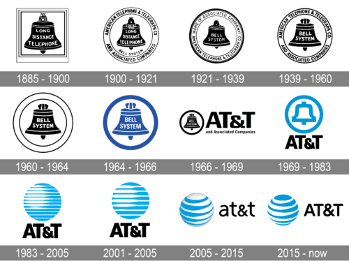
The genesis of the AT&T logo dates back to the late 19th century, a period that saw the birth of a black bell emblem enveloped by a triple square frame. This original logo carried the inscription “Long Distance Telephone” in a conventional uppercase typeface upon the black bell, setting the visual identity for AT&T.
1885 – 1900
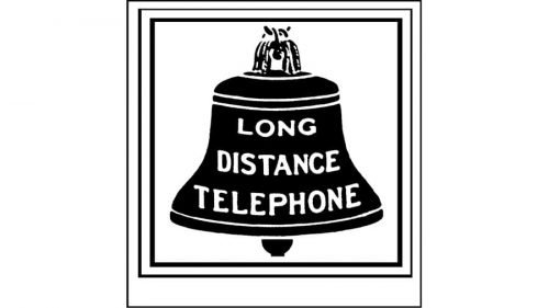
The maiden symbol designed for the brand in the late 1800s consisted of a black tinted bell, encased within a three-tier square. The phrase “Long Distance Telephone” was imprinted upon the bell in a classic font with all characters in italics, against a white background.
1900-1921
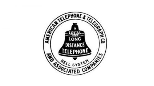
The dawn of the 20th century brought about a shape shift in the AT&T logo, transitioning the outer frame from a square to a circular form. Accompanying this change was the addition of text within the circular frame. The bell’s inscription evolved with the word ‘Local’ gracing the topmost part, and a new black wordmark, “Bell System,” finding its place below the bell.
1921-1939
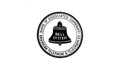
A slight textual reshuffle occurred in 1921, trimming down the lettering on the black bell to simply read “Bell System,” while the circular frame now encapsulated the text “American Telephone & Telegraph Co.”
1939-1964
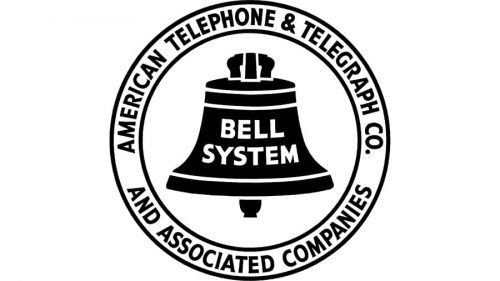
The year 1939 ushered in a bolder typography for the AT&T logo, retaining the previous composition but with a stronger and more pronounced outline, lending a serious and confident aura to the emblem.
1964-1969
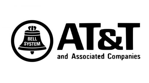
The mid-60s saw a shortened organization name, and consequentially, a revised logo to match. The emblem now sat to the left, flanked by a bold circular frame with the logo’s wordmark segmented into two levels on the right; a prominent “AT&T” on top, and “Associated Companies” below in a smaller font, all rendered in a monochrome palette.
1969-1982
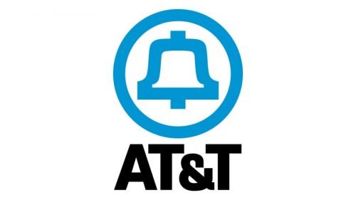
In 1969, the AT&T logo embraced color, courtesy of designer Saul Bass, who introduced a stylish blue bell emblem with blue outlined circular frames. The bold black typeface of the logotype was now positioned below the bell emblem.
1982-1996
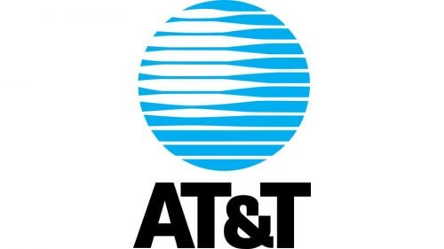
1982 witnessed another Saul Bass masterpiece as he retained the light blue and black color scheme but introduced a chic globe in place of the bell icon. This globe, ensconced in a solid light blue and white striped circular frame, earned the nickname “Death Star,” and set the foundation for the modern-day emblem of the company.
1996-2005
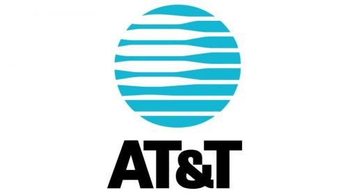
The logo underwent a minimalist redesign in 1996, reducing the number of blue and white stripes on the globe, and muting the bright blue color. However, the bold black lettering remained a constant.
2005-2015
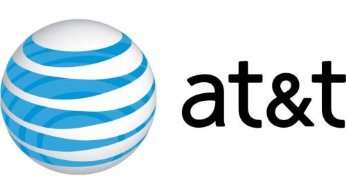
The merger of AT&T with SBC in 2005 called for a logo redesign by the Interbrand design bureau. Taking cues from previous versions, the new emblem featured a three-dimensional sphere with blue horizontal stripes and white as its primary color, while the bold black lettering transitioned to lowercase.
2015-Today

The redesign in 2015 flattened the AT&T logo while reinstating the uppercase lettering in the logotype. The enduring blue and white color palette remained, with blue taking the center stage as the primary color, paying homage to the company’s roots and traditions.
ATT Logo Elements
The ATT logo is an amalgamation of distinct elements, each serving a unique purpose in communicating the brand’s narrative and values. From the globe to the quicksilver line, each element tells a tale of ATT’s global ambitions and operational efficacy. Let’s delve deeper into the symbolism enshrined in its design elements.
Symbol
The modern-day symbol of AT&T, the globe, is a visual testament to the brand’s global aspirations. Despite the brand’s historical splittings, it continues to lead in terms of subscriber count. The consistent improvement in technology since its inception has fueled AT&T’s expansion on the global stage. The venture beyond the US market, albeit forced initially, marked the onset of a new epoch for the company, elevating its status on the global telecommunications arena.
Emblem
Transitioning from a monochrome to a tri-colored emblem, the modern logo flaunts a voluminous globe adorned with light blue and white stripes. At the convergence point, the blue lines intensify, lending depth and volume to the logo, a subtle yet effective design choice.
Font
The re-imagination of the AT&T logo also beckoned alterations in the “AT&T” font. A significant transition occurred in 1984, relocating the logotype alongside the emblem as opposed to its previous position below it. This shift in logo arrangement was accompanied by a transition from uppercase to lowercase lettering, a symbolic and fundamental change. Given the brand’s global stature, the utilization of lowercase in the logo became an emblematic representation of its growing influence.
Color
While the initial AT&T logo was crafted in monochrome, the modern emblem embraces colors. This color transition symbolizes a desire for greater visibility and allure, making the brand more engaging and visually appealing to the audience.
How to Create your own Logo with Logomak’s Logo Maker?
Creating a personalized logo has never been more straightforward with Logomak’s Logo Maker. This online platform offers an intuitive interface that enables you to craft a logo that resonates with your brand or company’s ethos in just three uncomplicated steps:
- Enter Your Business Name and Select the Category: Kickstart your logo creation process by inputting your business name and choosing the appropriate category that mirrors your industry.
- Pick the Best Colors and Fonts for Your Logo: Select colors and fonts that align with your brand’s identity, ensuring your logo is not only visually appealing but also representative of your brand’s character.
- Download a Free Design or Create a Professional Logo: Once satisfied with your design, you have the option to download a free version or elevate your logo by opting for a professional design.
5 Frequently Asked Questions about the AT&T logo
- What is the significance of the AT&T logo?
The AT&T logo symbolizes a globe to represent the company’s worldwide services and connectivity. Its blue color represents trust and reliability, while the stripes symbolize speed, agility, and diversity.
- When was the current AT&T logo introduced?
The current AT&T logo was introduced in 2005, designed by Interbrand.
- What are the changes made to the AT&T logo over the years?
The AT&T logo has evolved from the original bell logo, to a globe design in 1983, followed by a 3D effect added to the globe in 2005 to reflect a more modern and dynamic brand.
- Who designed the current AT&T logo?
The current logo was designed by the brand consultancy firm Interbrand.
- Why was the Bell logo associated with AT&T initially?
The Bell logo was associated with AT&T due to its historical ties with Alexander Graham Bell, the inventor of the telephone, and the Bell System of companies.
Wrapping Up
A compelling logo is a linchpin in propelling an app towards success. Now, the avenue to create a professional-grade logo devoid of any design skills is open to all. Indeed, you read that right! Logomak’s design software is your companion in this creative endeavor, offering a seamless pathway to crafting a logo that resonates with your brand’s ethos. Click here to ignite your logo design journey with Logomak and step into a realm where your brand’s visual identity comes to life effortlessly.


