Mozilla Firefox is more than just a browser; it’s a statement of freedom, a champion of open source, and a testimony to how community efforts can create a powerhouse. At the heart of this brand is its emblem, the Mozilla Firefox logo, a visual identity known by web surfers worldwide. The logo encapsulates the brand’s ethos, and its evolution over the years mirrors the browser’s journey from a Phoenix to the fox encircling the globe today. This article delves into the Mozilla Firefox logo’s history, dissecting its evolution, and the meaning embedded in its design.
Mozilla Firefox Logo Meaning and History
The Mozilla Firefox logo is not merely a stylized fox encircling a globe. It’s a narrative of the browser’s heritage, the community that propels it forward, and the brand’s mission to create a web where individuals have control. The logo has seen several transitions, each portraying a new chapter in the browser’s saga.
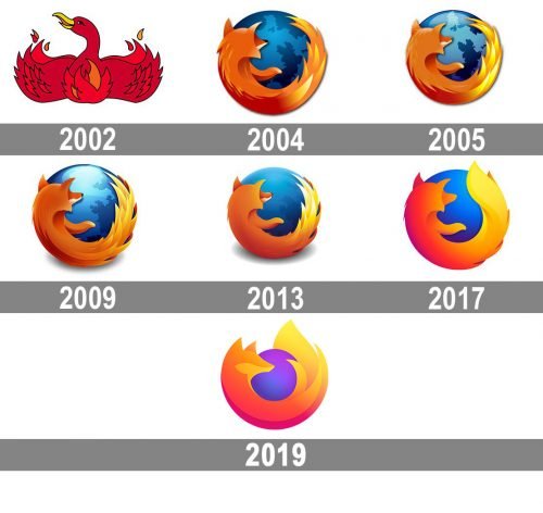
2002 – 2004

The inception of the Firefox logo dates back to 2002 when it was first known as Phoenix. However, the browser had to change its name and identity due to trademark issues. The name transitioned from Phoenix to Firebird, and eventually to Firefox. This period marked the birth of the iconic logo we’re familiar with today. The first version of the Firefox logo depicted a Phoenix, symbolizing the brand’s rise from the ashes, ready to take on the world.
2004 – 2005
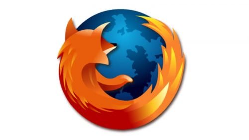
During this period, the transition from a mythical bird to a fox took place. The new logo showcased a swift fox encircling the globe, symbolizing speed, accuracy, and the global reach of the browser. This change was not just about aesthetics but was a nod to the browser’s improved capabilities and expanding user base. The globe in the logo represented the worldwide web, emphasizing Mozilla Firefox’s promise to provide an open, accessible, and user-friendly browser for everyone across the globe.
2005 – 2009
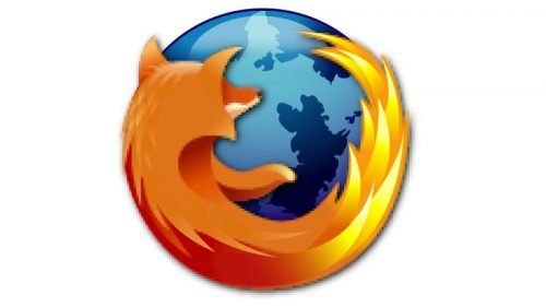
The logo underwent subtle refinements to depict a more modern and professional look. The fox’s rendering became more detailed, and the color palette became brighter and more engaging. These changes reflected Mozilla Firefox’s growing maturity and its solidifying position as a reputable browser. The design tweaks during this period were more about fine-tuning the logo to resonate better with the evolving aesthetics of the digital age.
2009 – 2013
During this phase, the logo saw further refinements in terms of color gradient and detailing. The tweaks were subtle but aimed at keeping the logo contemporary and reflective of the browser’s continuous improvements. The emblem continued to maintain its iconic fox and globe imagery, a testimony to the brand’s consistent vision.
2013 – 2017
As design trends shifted towards a flatter, minimalist aesthetic, the Mozilla Firefox logo too was streamlined. The details were simplified, and the colors were made more vibrant to align with modern design sensibilities. This period saw a shift towards a cleaner and more modern logo, aligning with the browser’s evolving features and the industry’s design trends.
2017 – 2019
In these years, the logo maintained its flat design but with an even more simplified and modern look. The fox’s depiction became more abstract, and the color palette was refreshed to keep up with the modern design aesthetics. These alterations were a reflection of Mozilla Firefox’s commitment to staying updated and relevant in the fast-evolving digital landscape.
2019 – Present
In the most recent update, the logo evolved to become more simplistic and abstract, yet maintaining its iconic imagery. The fox tail became a fluid line, encircling a gradient globe. This change, while subtle, symbolized a more modern, faster, and streamlined browser experience. The logo today stands as a symbol of reliability, speed, and the global community that continues to support and develop the Mozilla Firefox browser.
Each phase of the logo’s evolution tells a story of the brand’s journey, its challenges, and its commitment to delivering a browser that prioritizes user freedom and global accessibility.
Logo Elements
The Mozilla Firefox logo is rich in symbolism and meticulously designed to reflect the brand’s values and its commitment to creating an open web. Let’s delve into the key elements that make up this iconic emblem.
Symbolic Meaning
The primary imagery of the Mozilla Firefox logo – a swift fox encircling the globe, encapsulates the essence of what the browser stands for. The fox symbolizes agility, speed, and smart browsing, while the globe represents the worldwide web, underlining Mozilla Firefox’s global reach and its mission to keep the web open and accessible to all. Together, they depict a browser that’s fast, reliable, and globally accessible.
Typeface
The typeface used in the Mozilla Firefox logo is unique and designed to complement the emblem’s visual aesthetics. The sharp, modern letterforms mirror the sleek, agile nature of the fox, creating a harmonious visual identity that’s easily recognizable. The font exudes a contemporary vibe, aligning with the brand’s innovative and forward-thinking ethos.
Color Scheme
The color scheme of the Mozilla Firefox logo is both eye-catching and symbolic. The blend of warm orange and yellow hues, juxtaposed against the cool blue of the globe, creates a visual contrast that’s both appealing and reflective of the brand’s vibrant community. The orange signifies the passion and energy driving the Mozilla community, while the blue symbolizes the vast, unexplored expanse of the web.
The meticulous attention to detail in the Mozilla Firefox logo’s design elements reflects the brand’s dedication to delivering a user-centric browsing experience. Every component, from the symbolic imagery to the color palette and typeface, is crafted to resonate with the browser’s mission and the community it serves.
Previous Emblems
The journey of Mozilla Firefox’s visual identity is a testament to the brand’s evolution over the years. Each emblem carried its unique narrative, mirroring the changes and advancements in the browser.
Initially, the emblem featured a phoenix to signify the birth and rise of the browser from the ashes of Netscape Navigator, which faced a decline due to the browser wars. However, due to trademark disputes, a rebranding was necessary, leading to the introduction of the Firefox name and the fox emblem we are familiar with today.
The emblem transitioned from a mythical bird, symbolizing rebirth, to a swift fox encircling a globe, representing speed, global reach, and smart browsing. Over time, the emblem saw subtle yet impactful refinements, each echoing the browser’s technological advancements and the evolving design trends of the digital age.
This historical transition of emblems is not merely a change in visual identity but a narrative of Mozilla Firefox’s continuous strive for innovation, community engagement, and commitment to an open web.
5 Frequently Asked Questions About the Mozilla Firefox logo
- What does the Mozilla Firefox logo represent?
The Mozilla Firefox logo symbolizes a fox encircling the globe, representing speed, global reach, and the open-source nature of the project.
- Who designed the Mozilla Firefox logo?
The logo was designed by professional interface designer Jon Hicks, who was inspired to create a symbol that embodied the browser’s core values.
- Why was a fox chosen for the logo instead of any other animal?
The choice of a fox emphasizes the browser’s speed and agility, aligning with Mozilla’s goal to offer a fast browsing experience.
- Is there a specific name for the Mozilla Firefox logo?
There isn’t a specific name for the logo, but it is often simply referred to as the Firefox logo.
- Where can one find official assets of the Mozilla Firefox logo?
Official assets of the Mozilla Firefox logo can be found on the Mozilla brand website, which provides guidelines and downloadable files for public use.
Final Words
The Mozilla Firefox logo is more than a symbol; it’s a story of a brand that has continually evolved to offer a user-centric browsing experience. Its emblematic journey from a phoenix to a swift fox encircling the globe mirrors Mozilla Firefox’s mission to provide a fast, reliable, and open web browser for a global audience.
The meticulous design elements, coupled with a rich history, make the Mozilla Firefox logo a fascinating subject. It symbolizes a brand that values innovation, community, and the endless possibilities the web offers. As Mozilla Firefox continues to evolve, its logo remains a powerful visual identity, encapsulating the essence of what makes this browser a preferred choice for many around the globe.
The logo’s evolution over the years underscores the brand’s unwavering commitment to stay relevant, innovative, and user-focused in the fast-paced digital world. It’s a brand that has not only witnessed the web’s evolution but has been an active participant in shaping it.
This historical and emblematic journey of Mozilla Firefox paints a picture of a brand that’s ready to adapt, innovate, and continue offering a browser that stands the test of time, reflecting the dynamic nature of the digital realm we navigate daily.
With this, we wrap up our exploration into the Mozilla Firefox logo’s history and evolution, delving into its symbolic meanings, design elements, and the narrative embedded within its visual identity. Through every emblem transition, Mozilla Firefox reaffirms its position as a reliable, user-friendly, and innovative browser, ever-evolving to meet the needs of its global user base.
If you want to create a logo use Logomak to make it fast and easy.

