How to Create a Logo with Logomak
A logo is more than just text, an icon, and a color. A logo is the face of your brand. It reflects your company’s values and characteristics.
Creating a logo is a challenging task. There are plenty of things you must consider. Luckily, you won’t have to do it alone. With our step-by-step guide and the Logomak service, making a logo is easy and enjoyable. Now, let’s go from words to action.
Identify your target audience
A logo is not about trends or fashion. A smart logo performs a certain function and creates value for your company. Before designing your logo, you must figure out who your customers are, what they’re passionate about, and what qualities they value in your company. This approach ensures that your logo highlights certain emotions and builds a strong company personality.
How to create an effective logo
To create an appealing logo, you need to follow expert guidelines. For more information on this topic, check out article "What makes a good logo?" Below we’ve listed a couple of them.
Create a simple logo. Stick to a minimalist design to make a versatile, recognizable, and memorable logo.
Create a catchy logo. Generic logos are boring, so dare to be different. Make your logo memorable and original to set it apart from the competition.
Create a long-lasting logo. A good logo can stand the test of time and stay relevant throughout the years. Do not let your company be determined by fashion and fly-by-night trends. Instead of designing a completely new logo, the best companies improve their current logo, adjusting it to a new environment.
Create a versatile logo. Your logo must reproduce effectively across multiple formats and backgrounds.
Color of logo
When choosing a color for your logo, think about what color identifies your brand personality. For example, if your company is all about creativity and inspiration, consider using a yellow and orange palette.
In addition, make sure your selected color improves your logo readability and attracts the attention of potential customers. We have outlined some essential rules to follow when picking a color:
- Avoid using more than 4 colors. In logo design, less is more.
- Pick one or two basic colors. Use other colors as secondary hues.
- Do not be tempted to add more colors. It’s better to use subtle shades.
- Leave enough blank space to ensure that your logo is not hard on the eyes.
Font of Logo
The importance of choosing the right font can’t be overstated. While an appropriate font can emphasize your company’s strong sides, a poorly selected one will make your logo illegible and ruin your efforts to create a healthy corporate image.
Here are some basic tips to help you make the right choice.
Avoid popular fonts
Each of us has Microsoft Office, which offers a wide selection of fonts. The problem is that these fonts are used everywhere. Forget about standard OS fonts as well as fonts easily available on the internet. If you’ve seen the font many times, you should avoid it. Search for original fonts to make your logo stand out from the crowd.
Remember that trends come and go
Both your logo and font must stand the test of time. It would be stupid to invest lots of time and money into a design that will get old overnight.
Pick a legible font to make your logo text look good when scaled down
See how your selected font looks in different formats. Miles Davis, the great jazz trumpeter, once said that the notes you don’t play are more important than those you do play. Make sure to leave enough free space between symbols (kerning). If the distance is too big, the symbols will look isolated. If, on the other hand, the distance is too small, your logo will look cluttered.
Use a unique font
Your logo is part of your brand identity. It is your first contact with your potential customers. When choosing a font, think about what your brand stands for and what message you want to communicate. Is it speed, power, reliability, availability, or attention to detail? A stylish and fresh font is crucial to a successful logo.
How to choose a color and font in Logomak
As we already mentioned, the right color and font have the power to turn your logo into a valuable asset. Those are the most recognizable elements of your logo design.
It’s important to understand that a color and font affect the way customers perceive your logo and your brand. A color can evoke certain moods and build a strong emotional connection to your audience.
The internet has no lack of online logo makers. With Logomak, you can create and customize your logo in a couple of minutes.
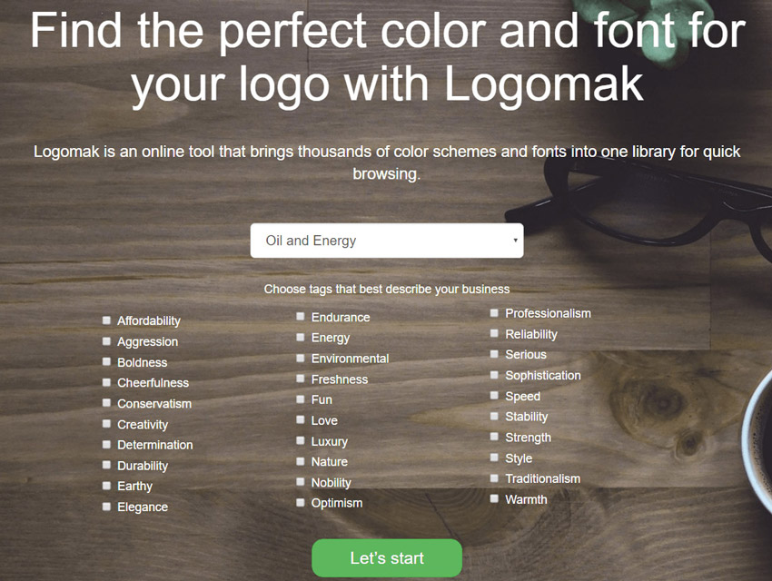
On the Logomak main page, select your business industry and specify the qualities you’d like your future logo to have.
Logomak will provide you with multiple color scheme options.
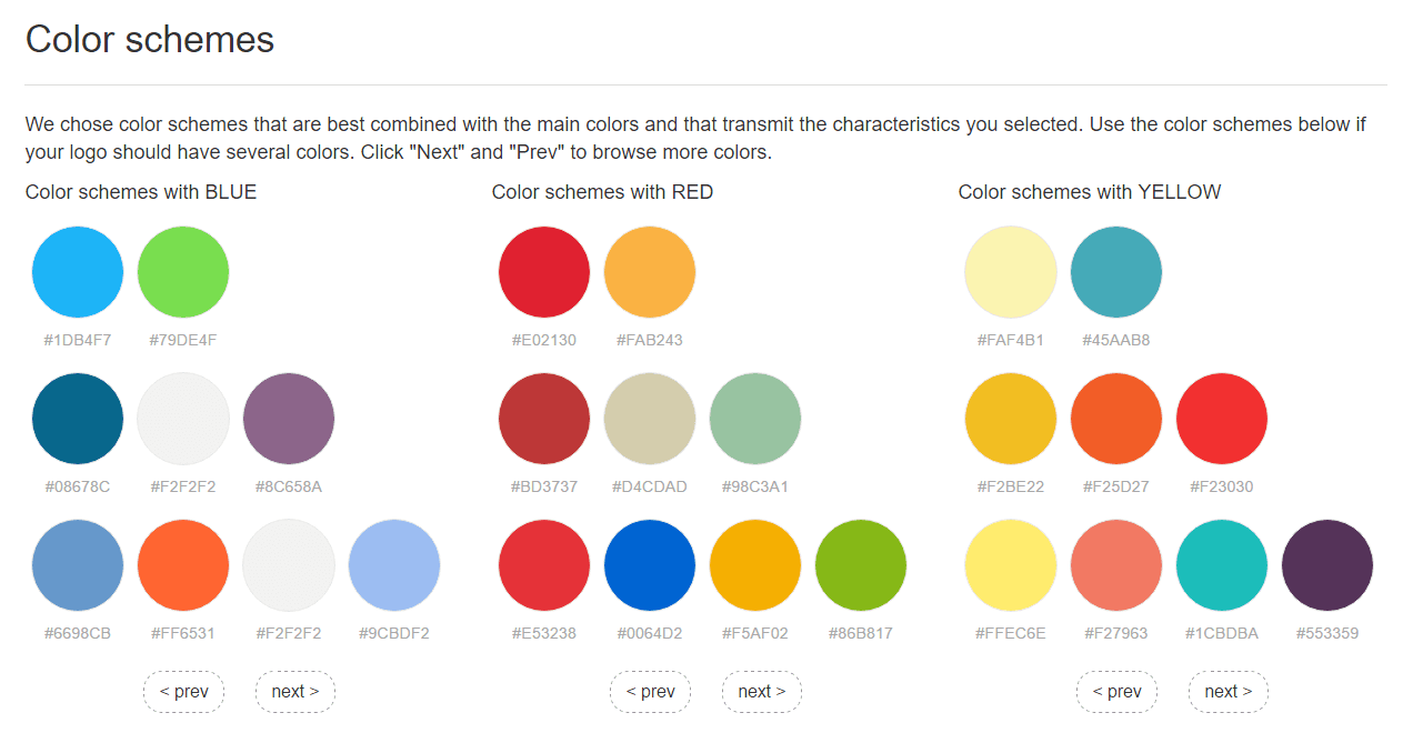
Each color has its own code. You can use the codes to create your logo in a graphic design program (Photoshop, Illustrator, etc.) or an online logo maker.
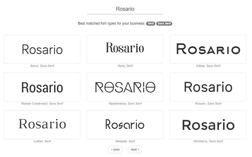
On top of that, Logomak will offer you several font options (Serif, Sans Serif, Modern, Display, etc.). Enter your text in a box and experiment with fonts all you want! Fancy a font? You can download it from the internet absolutely for free.
Once you’ve chosen the best color and font, feel free to use them in your logo design.