How Logomak works
You probably know that a logo consists of several components.
Color, font, and other elements affect the way a person perceives your logo.

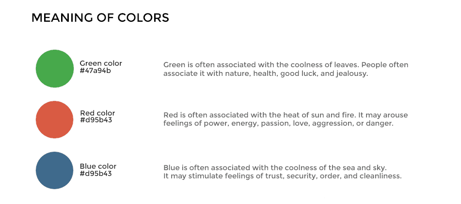
For example, green is associated with growth, health, and eco-friendliness. The color green makes people feel relaxed and invigorated.
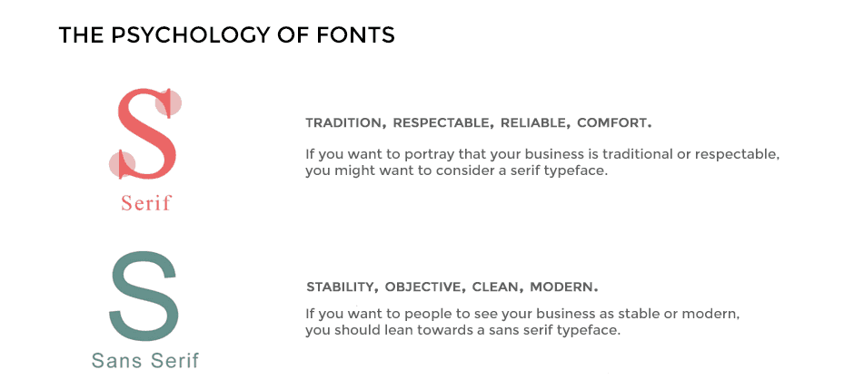
The same is true for fonts. For instance, fonts with serifs channel ideas of respect and tradition. This type of font is a great choice for projects that have a conservative approach, such as a university or a bank. Airy and edgy, fonts without serifs (e.g., Helvetica) are good choices for tech projects, IT companies, and media businesses.

Color and font have the power to emphasize attributes of your brand that you wish to demonstrate. Knowing the psychological connotations behind different colors, fonts, and shapes is crucial for making a successful logo.
Luckily enough, Logomak allows you to pick the right colors and fonts in a matter of seconds. But how does Logomak know which colors and fonts are best for your company?
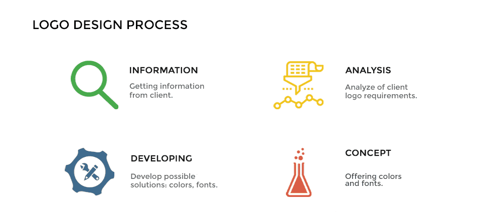
We analyzed logos used in multiple industries and by top companies. We studied how certain colors and fonts affect the way a logo is perceived.
We used this information to build smart algorithms. They allow us to pick the optimal color and font combination to reveal your brand identity.
All you need to do is indicate your type of business and which attributes you’d like to convey through the logo.

Logomak will come up with several color and font alternatives. Use your creative energy to compose a combination you like best!
Moreover, Logomak displays your industry-related logos. You can check your competitors’ solutions and decide which ones you like and which ones you wish to avoid.